Standing in the lighting aisle of a hardware store at dusk, holding two different cardboard boxes labeled "Warm White," can feel like an exercise in frustration. One box promises a cozy 3000K, while another whispers of an inviting 2700K. You take them home, screw them into your living room fixtures, and suddenly your cream-colored walls look aggressively yellow, or worse, surprisingly clinical and peach-toned. The term "warm white" is thrown around by manufacturers as a blanket descriptor for comfort, yet it hides a surprisingly vast spectrum of chromatic reality.
Color is never an absolute static value when it comes to illumination; it is a moving target shaped by physics, human biology, and environmental context. Over the past decade of specifying architectural lighting for residential remodels and commercial spaces, I have watched clients chase the elusive ghost of the "perfect cozy glow." They buy bulbs marketed as warm white, only to find their carefully curated interior palettes ruined by unexpected green spikes or jarring amber casts. Understanding what color warm white actually is requires stepping past marketing buzzwords and diving into the physics of correlated color temperature, spectral power distribution, and how our brains process light long after the sun goes down.
To pin down the true hue of warm white, we have to look backward to incandescent bulbs and forward to solid-state semiconductor physics. For more than a century, humanity lived under the glow of a tungsten filament heated to white-hot temperatures. That specific, comforting glow became our baseline for interior safety and relaxation. When LEDs entered the market, engineers scrambled to replicate that exact sensory experience using phosphors and diodes. Yet, manufacturing tolerances, color rendering indices, and shifts in lumens meant that "warm white" became less of a single exact shade and more of a neighborhood on the Kelvin scale. Navigating this neighborhood demands a keen eye, a bit of technical literacy, and a willingness to test before you commit your entire home to a single color temperature.
The Kelvin Scale and the Science Behind Warm White Illumination
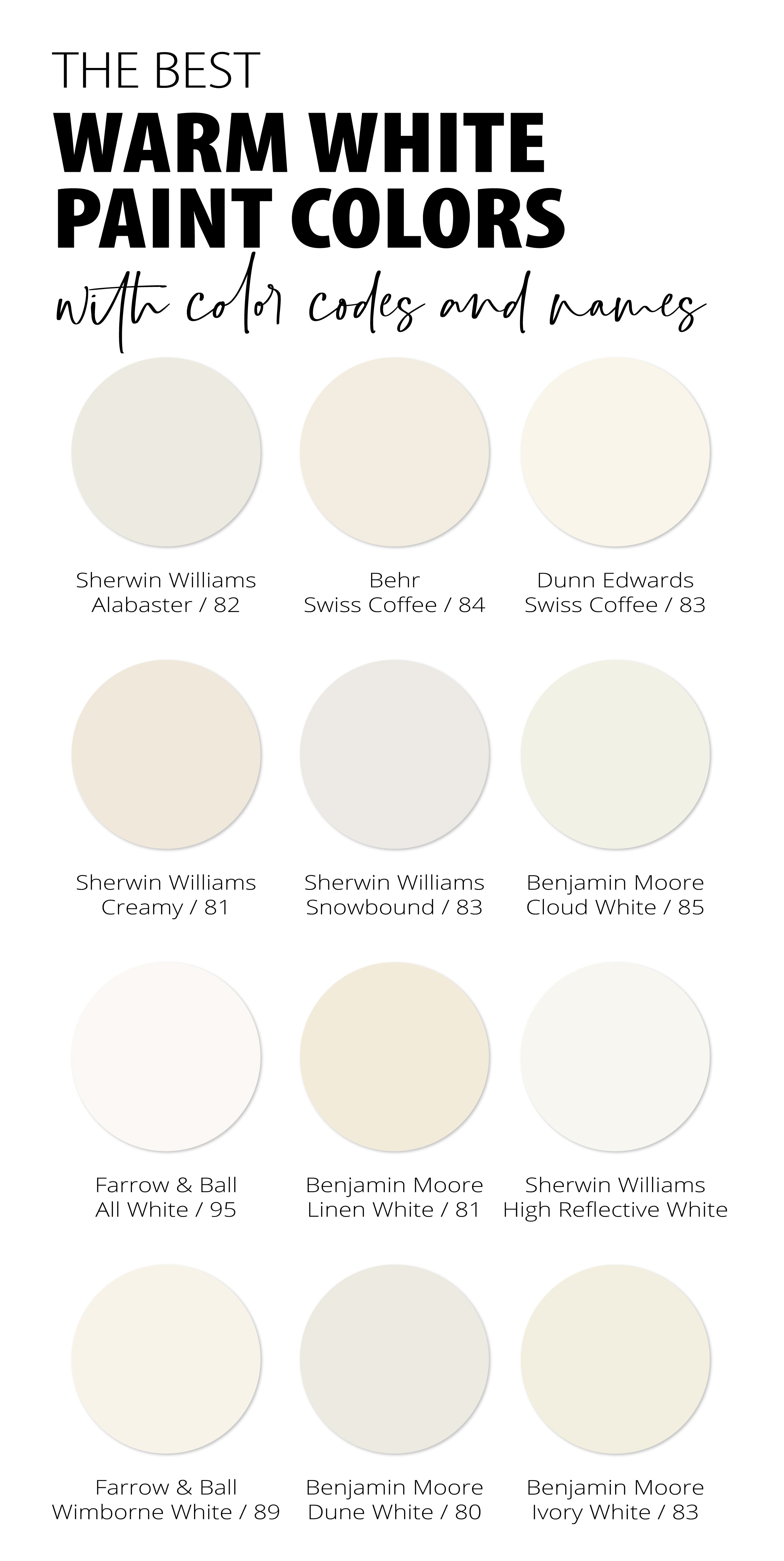
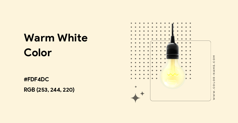
At its physical core, warm white is not a single spectral wavelength of light like pure red or green; rather, it is a human-perceived blend of various wavelengths emitted when a theoretical blackbody radiator is heated to a specific temperature, measured in Kelvin (K). Contrary to intuitive color psychology where blue is "cold" and red is "hot," physics turns this on its head. Lower Kelvin temperatures represent warmer, redder, and yellower light, while higher Kelvin numbers push toward cooler, bluer spectrums. When we talk about warm white, we are generally anchoring our discussion between 2200K and 3000K, a range that mimics the transition of natural light from the glowing embers of a campfire up through the golden hour and into early morning sunlight.
The mechanics of how LEDs produce this warm white light rely heavily on chemistry and manufacturing precision. Unlike an incandescent bulb that radiates a continuous spectrum because a physical wire is glowing, a standard warm white LED starts with a high-energy blue semiconductor chip. This chip is then coated with a precise mixture of rare-earth phosphor compounds that absorb a portion of the blue light and re-emit it as longer, lower-energy wavelengths of yellow, orange, and red. The exact blend of these phosphors dictates whether the resulting light leans toward a buttery, golden hue or a slightly starker, neutral-adjacent ivory. If the phosphor coating is too thin, blue light leaks through, creating an unnatural spike in the spectrum that makes interiors feel sterile.
Evaluating color temperature requires looking beyond the basic Kelvin number to understand the concept of Spectral Power Distribution (SPD). The SPD graph maps out the exact intensity of every wavelength of light emitted by a source. A traditional 2700K incandescent bulb features a smooth, continuous curve that ramps up steadily toward the red end of the spectrum, which is why skin tones look so remarkably rich under old-school lighting. Modern warm white LEDs, by contrast, often show sharp jagged peaks in their SPD charts. Recognizing these subtle differences helps explain why two bulbs rated at the exact same 3000K can look completely different side-by-side in a real-world living space.
Measuring color accuracy also involves the Color Rendering Index (CRI) and newer metrics like the TM-30 standard. CRI measures how faithfully a light source reveals the true colors of objects compared to a natural reference light like the sun or an incandescent bulb, scored out of 100. A high CRI of 90 or above ensures that your warm white light doesn't wash out reds and earthy tones. When warm white LEDs have a low CRI, the light can appear muddy, flattening the rich mahogany of your furniture or turning warm skin tones into an unappealing, chalky gray. True warm white relies not just on the right Kelvin temperature, but on a robust spectrum capable of rendering pigments accurately.

Navigating the Spectrum from 2200K Candlelight to 3000K Crisp Warmth
The warm white category is far from a monolith; it spans a distinct gradient of color temperatures, each serving a vastly different psychological and functional purpose in interior design. At the lowest end of the warm spectrum sits 2200K to 2400K, often termed "extra warm white" or "candlelight." This light is deeply amber, heavily saturated with golden-orange tones, and designed almost entirely for ambient mood creation. Walking into a room illuminated solely by 2200K sources feels like stepping back into a historic tavern or a candlelit dining room. It drastically reduces blue light exposure, signaling the human circadian system to wind down, but it makes reading fine print or performing detailed visual tasks frustratingly difficult due to the low contrast.
Moving up the scale brings us to 2700K, the undisputed darling of residential interior design and the closest digital approximation of the traditional 60-watt incandescent bulb. If you ask an average homeowner what color warm white looks like, they are almost certainly picturing 2700K. It delivers a soft, inviting yellow-white glow that flatters wooden finishes, warm textiles, and human skin tones. It strikes a delicate balance: warm enough to feel cozy and intimate in bedrooms and living rooms, yet bright and clear enough to keep a kitchen workspace functional once the sun goes down. However, in homes with stark minimalist architecture, brilliant white walls, and cool gray concrete floors, 2700K can sometimes look aggressively yellow, clashing with the modern aesthetic.
Further up at 3000K, the character of the light shifts into what lighting designers frequently call "warm neutral" or "crisp warm white." At 3000K, the golden-yellow undertones recede significantly, replaced by a clean, ivory-white appearance that feels modern, fresh, and alert. This is the standard color temperature specified for high-end hospitality spaces, upscale retail stores, and contemporary kitchens where task accuracy matters. It bridges the gap between the coziness of traditional lighting and the clarity needed for modern living. Yet, for some people coming from a lifetime of cozy incandescent environments, 3000K can initially feel a bit too clinical, resembling the waiting room of a dental office rather than a relaxing domestic sanctuary.
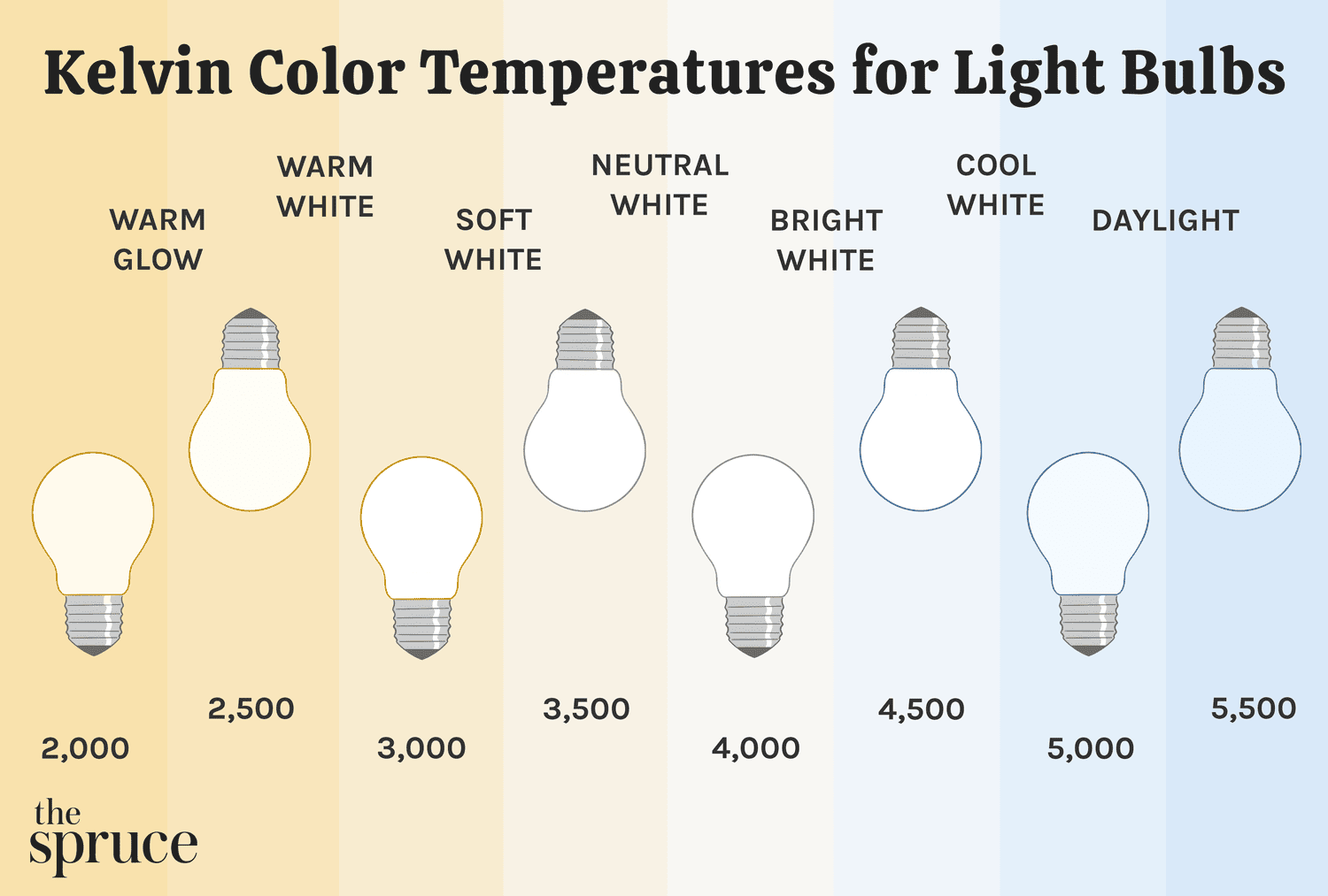
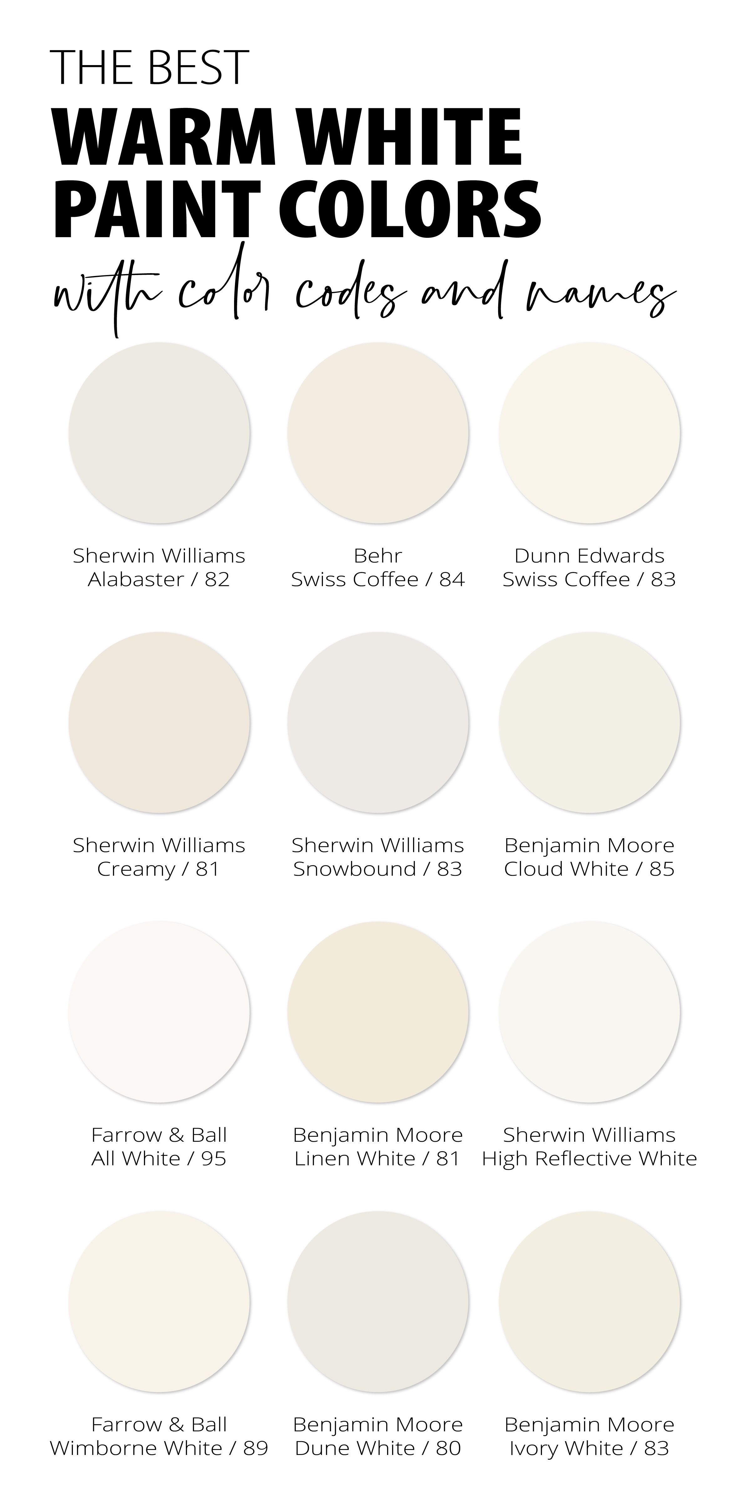
Choosing between these subtle gradations requires analyzing the specific functional requirements of each room and the reflective properties of your interior surfaces. Paint colors containing heavy blue or green undertones will react violently to a 2700K bulb, sometimes shifting into unexpected muddy hues, whereas they might harmonize beautifully under a cleaner 3000K source. Conversely, warm terracotta tiles and rich walnut wood paneling absorb the golden rays of a 2200K or 2700K source and radiate an intoxicating depth that a 3000K bulb would inadvertently flatten. Matching your warm white color temperature to your spatial materials is an art form rooted in empirical observation.
Step-by-Step Methodology for Selecting and Testing Warm White Lighting
Getting the lighting right in a home or workspace requires a methodical, hands-on approach rather than blindly trusting box labels. Because color perception is relative and influenced by surrounding surfaces, furniture, and natural daylight, following a structured testing protocol prevents costly mistakes and ensures your spaces feel cohesive.
Executing this protocol removes the guesswork from lighting design. Far too many renovators spend thousands of dollars on custom cabinetry and paint, only to ruin the final visual presentation by mixing a harsh 4000K utility bulb into a cozy reading nook or pairing a muddy 2400K bulb with modern white quartz countertops.
Common Pitfalls in Warm White Selection and How to Avoid Them
Even experienced designers occasionally fall into traps when specifying warm white lighting, largely due to the deceptive nature of LED manufacturing and human chromatic adaptation. Being aware of these common pitfalls allows you to anticipate issues and implement proven workarounds before you drill a single hole or wire a new circuit.
Navigating these challenges requires patience and a willingness to pay attention to the technical details printed on packaging or product data sheets. The extra effort spent sourcing high-CRI, properly binned warm white fixtures pays massive dividends in the overall comfort and aesthetic integrity of your interior spaces.
The Broader Impact of Warm White Lighting on Human Biology and Architecture

Related Posts

Real Solutions for Organizing Entryways and Mudrooms Without Losing Your Sanity

How to Design Mudroom Storage That Actually Keeps Your Family Organized

What Years of Home Design Interviews Taught Me About Choosing a Mudroom Storage Bench

Why interior designers recommend Halloween doorway curtains for effortless seasonal decorating
How Natural Light Changes Warm White Paint Colors Throughout the Day

Designing a Seasonal Fall Table Setup Using Foraged Elements and Everyday Dinnerware
Beyond simple aesthetics, the color of warm white light plays a profound role in human circadian biology, psychological well-being, and the energy efficiency of modern buildings. For millions of years, human biology evolved under a dynamic natural light cycle—bright, blue-rich daylight during active hours, followed by warm, red-rich light as the sun dipped below the horizon. This natural rhythm triggers the production of melatonin, the hormone responsible for deep, restorative sleep. Introducing high-intensity, cool white light into residential environments late at night disrupts this delicate hormonal cascade, contributing to sleep disruption, elevated stress, and chronic fatigue.
Architectural lighting design has increasingly embraced human-centric lighting (HCL) systems that leverage tunable white LEDs. These advanced systems shift dynamically throughout the day, starting as a crisp, energizing white in the morning to support focus and alertness, and transitioning seamlessly into a rich, deep warm white in the evening to promote relaxation and natural melatonin synthesis. Warm white is no longer just a static aesthetic choice; it is a biological tool used to align our indoor living environments with our ancient physiological programming, bridging the gap between modern architecture and human health.
From an economic and environmental standpoint, the transition to high-efficiency warm white LEDs has drastically reduced global energy consumption while preserving the psychological comfort associated with traditional incandescent lighting. Early-generation LEDs struggled to produce an appealing warm white without sacrificing massive amounts of luminous efficacy. Today, advanced phosphor engineering allows modern LEDs to pump out upwards of 100 lumens per watt while maintaining a gorgeous, high-CRI warm white glow. This synergy between energy sustainability and visual warmth ensures that homeowners no longer have to choose between lowering their carbon footprint and creating an inviting, cozy home environment.
Looking forward, the integration of smart home ecosystems with advanced color-tunable lighting promises even greater personalization. Users can program their lighting to track the exact solar arc of their geographic location, ensuring that their indoor warm white shifts organically in sync with seasonal changes in daylight. This holistic approach to illumination transforms lighting from a passive utility into an active participant in our daily lives, enhancing our moods, protecting our sleep cycles, and accentuating the architectural beauty of our homes with precise chromatic accuracy.
Actionable Takeaways for Masterful Warm White Lighting Design
Synthesizing the technical data, practical methodologies, and biological insights into a cohesive framework empowers anyone to transform their lighting scheme from mediocre to exceptional. Whether you are outfitting a newly constructed home or simply swapping out flickering bulbs in an older apartment, keeping a few core principles in mind guarantees professional-grade results.
Implementing these guidelines ensures that your lighting scheme operates as a seamless extension of your design vision, enhancing both the emotional atmosphere and the functional utility of your environment.
The pursuit of the perfect warm white light is ultimately an exploration of how we want to feel within our built environments. Color temperature is not just a scientific metric confined to a physics textbook; it is the invisible brushstroke that defines how we experience our homes, how we interact with our families at the end of a long day, and how we wind our minds down for rest. By moving past generic marketing labels and engaging directly with the nuances of Kelvin scales, spectral power distributions, and color rendering indices, we take control of our visual surroundings.
As solid-state lighting technology continues to mature, our ability to manipulate warm white light with surgical precision will only improve. We stand at the intersection of technological innovation and timeless human comfort, where the warm, familiar glow of a campfire can be perfectly replicated by advanced semiconductor physics. By approaching lighting design with intention, curiosity, and technical respect, we can craft spaces that are not only visually stunning but deeply nurturing to the human spirit.
