Standing in the center of a newly plastered room with a brush in hand, I once watched a pristine gallon of designer white turn a glaring, clinical blue under the harsh glare of unfiltered northern daylight. It was an expensive, humbling lesson learned on-site: white paint is never just white. Across hundreds of residential transformations, that single rookie mistake transformed how I look at architectural coatings forever. Choosing a white paint color is less about picking a neutral backdrop and more about engineering how light interacts with your living space.
When you get it right, warm white paint colors wrap a room in an effortless, organic embrace. They breathe life into heritage moldings, soften contemporary minimalist lines, and provide a forgiving canvas for art, textiles, and daily life. Yet, achieving that elusive magazine-worthy glow requires looking past the glossy marketing swatches and understanding the hidden science of pigmentation, light reflectance values, and directional exposure.
For decades, the architectural and interior design industries treated white as a blank slate—an absence of color meant to erase spatial boundaries. But contemporary interior design has evolved past sterile, stark starkness. Homeowners and restoration specialists alike now demand nuance, emotional resonance, and spatial warmth. Understanding how to harness these complex hues separates amateur renovations from professional, enduring design masterpieces.
Decoding the Physics of Undertones and Light Reflectance Values
Every single can of white paint carries a complex chemical signature hiding beneath its deceptively simple exterior. Color chemists formulate whites by blending titanium dioxide white bases with microscopic dabs of raw umber, yellow oxide, green, or red colorants. These tiny additions create what we call undertones—the subtle chromatic currents that emerge once the paint dries and interacts with your home's unique illumination ecosystem. A paint color that looks buttery and inviting in a brightly lit showroom can suddenly flash an aggressive, undesirable yellow when rolled onto a wall backed by incandescent fixtures.
Light Reflectance Value, universally abbreviated as LRV, serves as your most critical objective metric when evaluating any paint formulation. Measured on a scale from zero to one hundred, LRV dictates the exact percentage of light a paint surface reflects back into a room. True, absolute black sits at zero, while a hypothetical pure, light-absorbing white sits at one hundred. Most commercially available warm white paint colors hover safely between an LRV of 75 and 90. Grasping this number prevents catastrophic design choices; a paint with an LRV of 85 will bounce immense amounts of light around a dark basement, whereas a lower LRV of 76 absorbs more light, creating an intimate, moody cocoon in a sun-drenched penthouse.
Beyond numerical values, the physical orientation of your windows dictates how these undertones behave throughout the daylight hours. North-facing rooms pull in cold, bluish light that strips warmth from interiors, demanding creamy or yellow-based whites to compensate for the atmospheric chill. Conversely, south-facing rooms flood spaces with intense, golden sunshine that can push warm whites into blinding, buttery territory if you aren't careful. East-facing morning light brings a crisp, energetic clarity, while west-facing afternoon rays cast long, amber shadows that amplify earthy red or beige undertones.
Mastering this delicate dance between LRV, directional exposure, and colorant chemistry requires patience, empirical testing, and an eye trained to spot the subtle shifts that happen as morning turns to dusk. Ignoring these foundational physical laws is the primary reason DIY painters find themselves repainting rooms just weeks after finishing the initial coat. By treating paint as a reactive optical coating rather than a flat pigment, you gain total control over the emotional and aesthetic atmosphere of your home.
Navigating the Spectrum of Classic and Contemporary Warm White Formulations
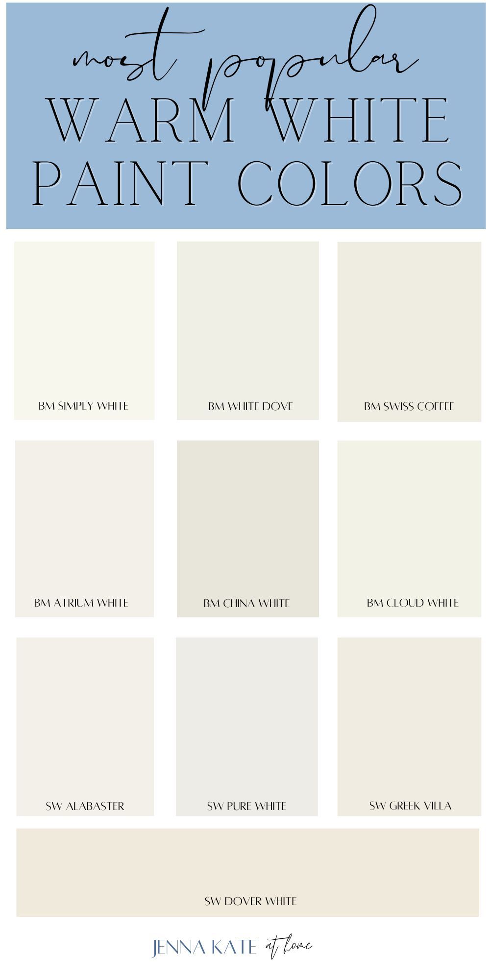
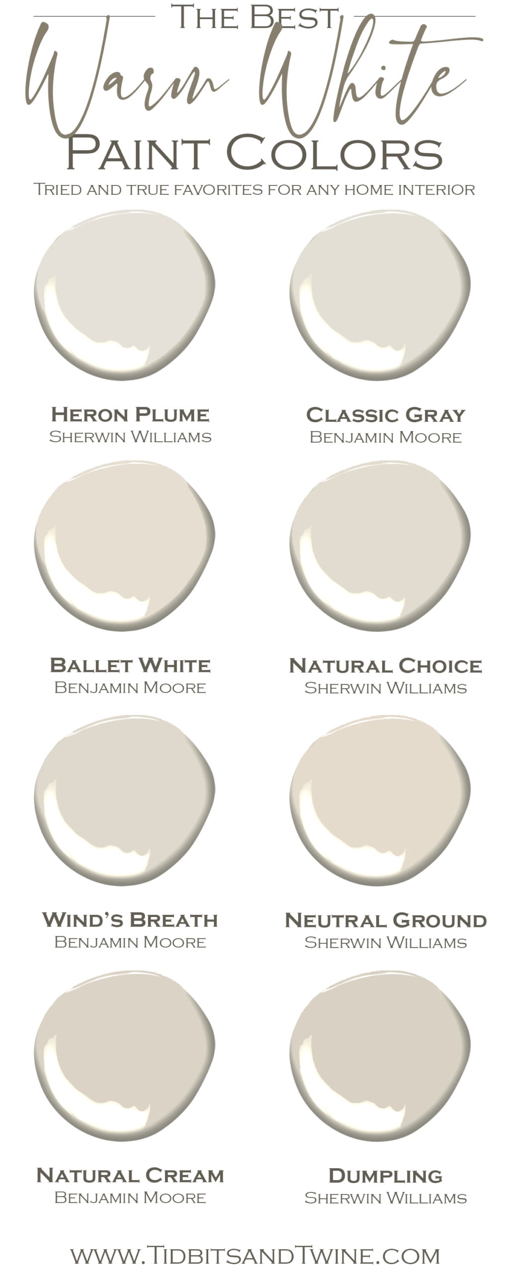
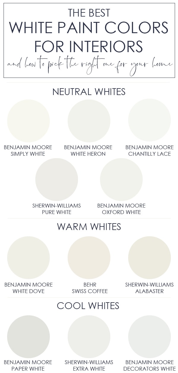
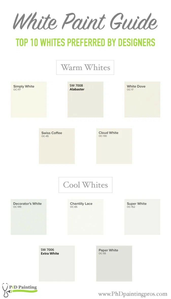
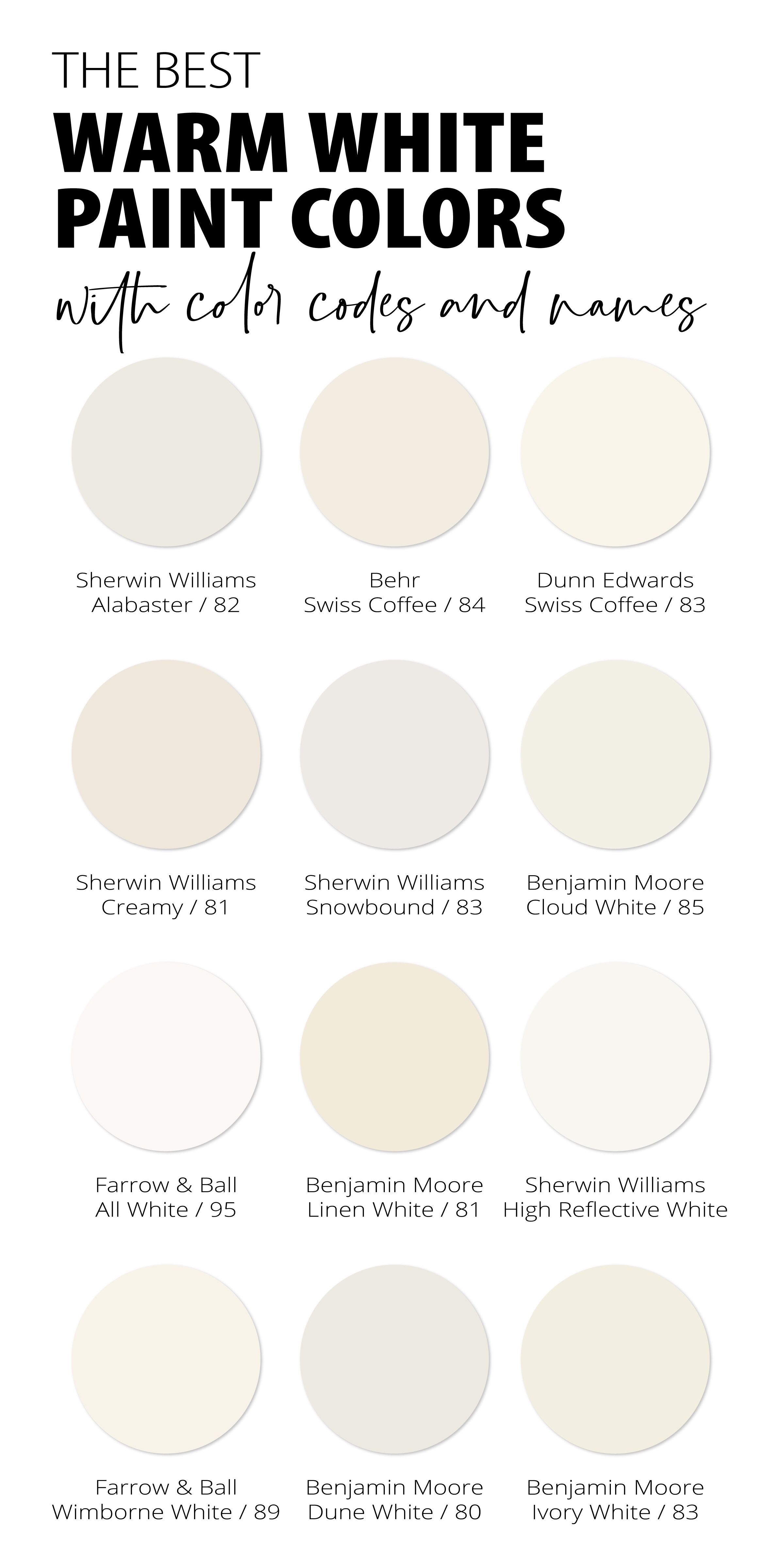
The modern paint market offers an overwhelming array of formulations, each claiming to be the ultimate warm white. Industry icons like Benjamin Moore's Swiss Coffee and decorator favorites like Sherwin-Williams Alabaster have achieved legendary status for a reason. They walk a razor-thin tightrope between crisp cleanliness and organic comfort. Swiss Coffee, for instance, relies on a delicate balance of green and gray colorants embedded in its base, preventing it from reading as overly yellow while maintaining a creamy, comforting depth.
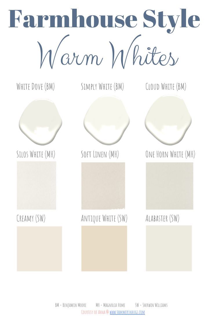
Diving deeper into specific formulations reveals stark differences in character. Sherwin-Williams Alabaster leans slightly softer and more approachable, featuring a subtle greige undertone that anchors it firmly in contemporary transitional design. Farrow & Ball's Pointing andering into traditional English cottage territory, carrying a distinct peachy-yellow warmth that feels utterly at home alongside reclaimed timber and historic lime plaster. Meanwhile, options like Benjamin Moore White Dove offer a cleaner, more versatile profile with just enough greige to keep it from looking dated or stark, making it the go-to default for architectural millwork across North America.
Choosing among these heavy-hitters demands a granular look at your home's fixed elements. Flooring species, countertop stone slabs, and window frame colors act as permanent color anchors that will either harmonize with or clash against your chosen wall paint. An oak floor with heavy golden notes will pull out the yellow undertones in a warm white, sometimes pushing the overall effect past cozy and straight into overwhelming. Conversely, cool gray stone tiles can make a creamy, yellow-based white look dirty or unkempt by comparison.
Successful curation means analyzing your space as a holistic ecosystem. You must audit your furniture upholstery, artwork palettes, and even neighboring room transitions before committing to a gallon. A warm white that looks stunning in an open-concept kitchen with white quartz counters might look completely washed out or mismatched when viewed against a moody, charcoal-painted hallway. Treating paint selection as a relational exercise rather than an isolated choice ensures a cohesive, intentional flow throughout your entire living environment.
Step-by-Step Practical Implementation Guide for Flawless Application
Achieving a professional-grade finish with warm white paint requires far more than just opening a can and rolling it onto drywall. Because white paint inherently possesses lower hiding power than saturated colors due to higher titanium dioxide concentrations, execution technique matters profoundly. Follow this field-tested methodology to ensure flawless coverage and enduring durability.
Common Pitfalls and Field-Tested Workarounds for Warm White Projects
Even experienced painters occasionally stumble when working with complex white formulations. The margin for error is razor-thin because human eyes are exceptionally sensitive to variations in tone and sheen across large vertical surfaces. Recognizing these common traps before they ruin your project saves both time and money.
The Broader Economic and Emotional Impact of Thoughtful Color Design
The color choices we make within our domestic spaces carry profound psychological and economic weight that extends far beyond immediate visual appeal. In contemporary interior architecture, warm white paint colors act as a stabilizing psychological anchor. In an era marked by digital fatigue and relentless sensory stimulation from screens, walking into a home wrapped in organic, soft white tones helps lower cortisol levels and promotes a genuine sense of sanctuary. Environmental psychologists note that complex, warm-undertoned neutrals reduce visual friction, allowing the human eye and brain to rest.
From an economic perspective, mastering the application of high-end warm white paint is one of the highest-ROI home improvement investments available. Real estate data consistently demonstrates that homes painted in cohesive, light-reflecting, professional-grade warm whites command higher market valuations and sell faster than properties finished in dated, heavy colors or sterile, cold whites. Buyers looking at property listings project their own lives and furnishings onto neutral backdrops; a well-executed warm white provides a luxurious, move-in-ready aesthetic that signals meticulous maintenance and elevated taste.
Related Posts
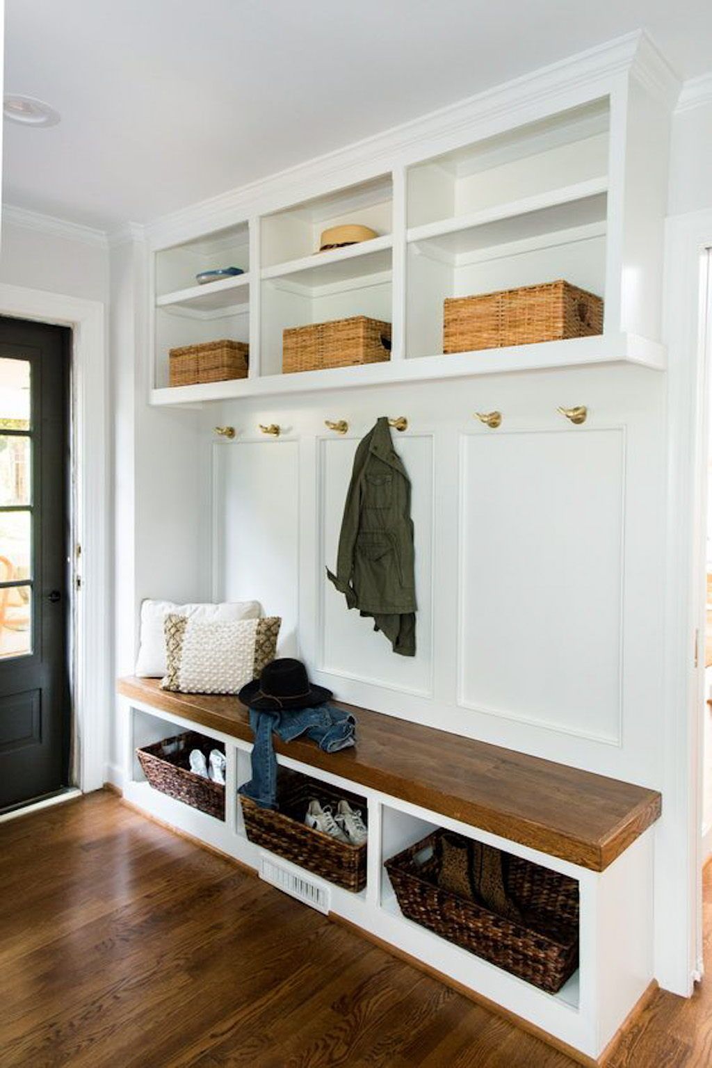
Real Solutions for Organizing Entryways and Mudrooms Without Losing Your Sanity
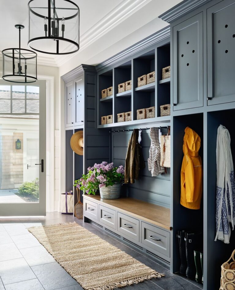
How to Design Mudroom Storage That Actually Keeps Your Family Organized
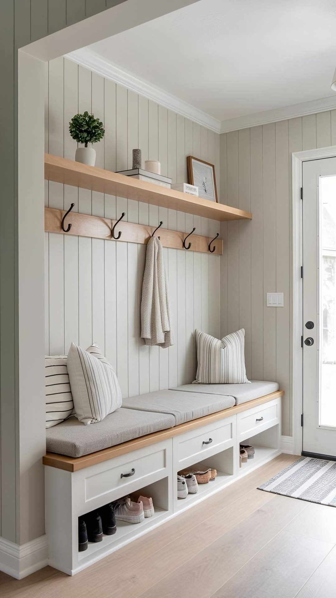
What Years of Home Design Interviews Taught Me About Choosing a Mudroom Storage Bench
Why interior designers recommend Halloween doorway curtains for effortless seasonal decorating
How Natural Light Changes Warm White Paint Colors Throughout the Day

Designing a Seasonal Fall Table Setup Using Foraged Elements and Everyday Dinnerware
Furthermore, the sustainability movement has driven paint manufacturers to reformulate their white bases with ultra-low volatile organic compounds (VOCs) and bio-based resins. Modern architectural coatings no longer require sacrificing indoor air quality for durability. High-performance mineral paints and clay-based whites offer breathable, vapor-permeable surfaces that prevent moisture entrapment in historic walls while delivering breathtaking aesthetic depth. This intersection of ecological mindfulness and classical design elegance ensures that warm white remains a timeless, future-proof choice for conscious homeowners.
Ultimately, designing with warm white is an exercise in mindfulness. It forces us to slow down, observe the subtle passage of light across our walls, and respect the physical realities of materials and space. When you approach color selection with technical rigor and artistic intuition, you transform ordinary drywall into a dynamic, living medium that elevates everyday life.
Actionable Recommendations and Key Takeaways for Your Next Project
Distilling the complexities of warm white paint into a practical framework ensures you approach your upcoming painting project with absolute confidence. Success in architectural painting relies on a disciplined process of elimination, testing, and meticulous execution.
Standing back to admire a freshly painted room where the warm white walls seem to breathe with the natural light is one of the most rewarding experiences in home design. We have dismantled the myth that white is a lazy or generic choice, revealing it instead as the most sophisticated and nuanced tool in the interior designer's palette. It is a medium that demands respect for physics, architecture, and human psychology.
As you embark on your own design journey, remember that perfection in painting is not about following rigid rules blindly, but about understanding how light, pigment, and space converse within your specific home. Take your time with the swatches, honor the prep work, and don't rush the drying process. By treating paint as an architectural coating rather than a superficial cover-up, you create an enduring foundation for a home that feels authentic, welcoming, and profoundly your own.
