Step onto any residential job site at seven in the morning, and you will witness a universal ritual of design anxiety. A homeowner stands clutching a stack of six-inch paint swatches, squinting against the raw glare of unfinished drywall while trying to decode why a supposedly neutral white looks aggressively yellow on the north wall and ice-blue on the south. White paint is notoriously deceptive. Stripped of obvious color, it acts like a mirror, reflecting everything happening around it—from the canopy of green maples outside the window to the warm amber glow of interior LED fixtures.
The pursuit of the perfect warm white paint color is rarely about finding a single, magical formula that works everywhere. Instead, it is an exercise in applied physics and spatial psychology. Over years of specifying colors for historic renovations and contemporary builds alike, I have watched clients fall into the trap of grabbing the most popular white on the market, only to find their rooms feeling sterile or uncomfortably buttery. Achieving that enveloping, soft-focus sanctuary look requires understanding the hidden architecture beneath the surface of the can.
Warm whites occupy a very specific, highly contested real estate in interior design. They sit right on the razor-thin margin between stark, gallery-style clinical whites and heavy, overtly yellow creams. When executed correctly, a warm white breathes life into a room, bouncing natural light around while wrapping the occupants in a subtle, comforting cocoon. Navigating this design challenge demands a shift away from trendy labels and toward a granular understanding of Light Reflectance Value (LRV), chromatic undertones, and spatial orientation.
Cracking the Code of Light Reflectance and Chromatic Undertones
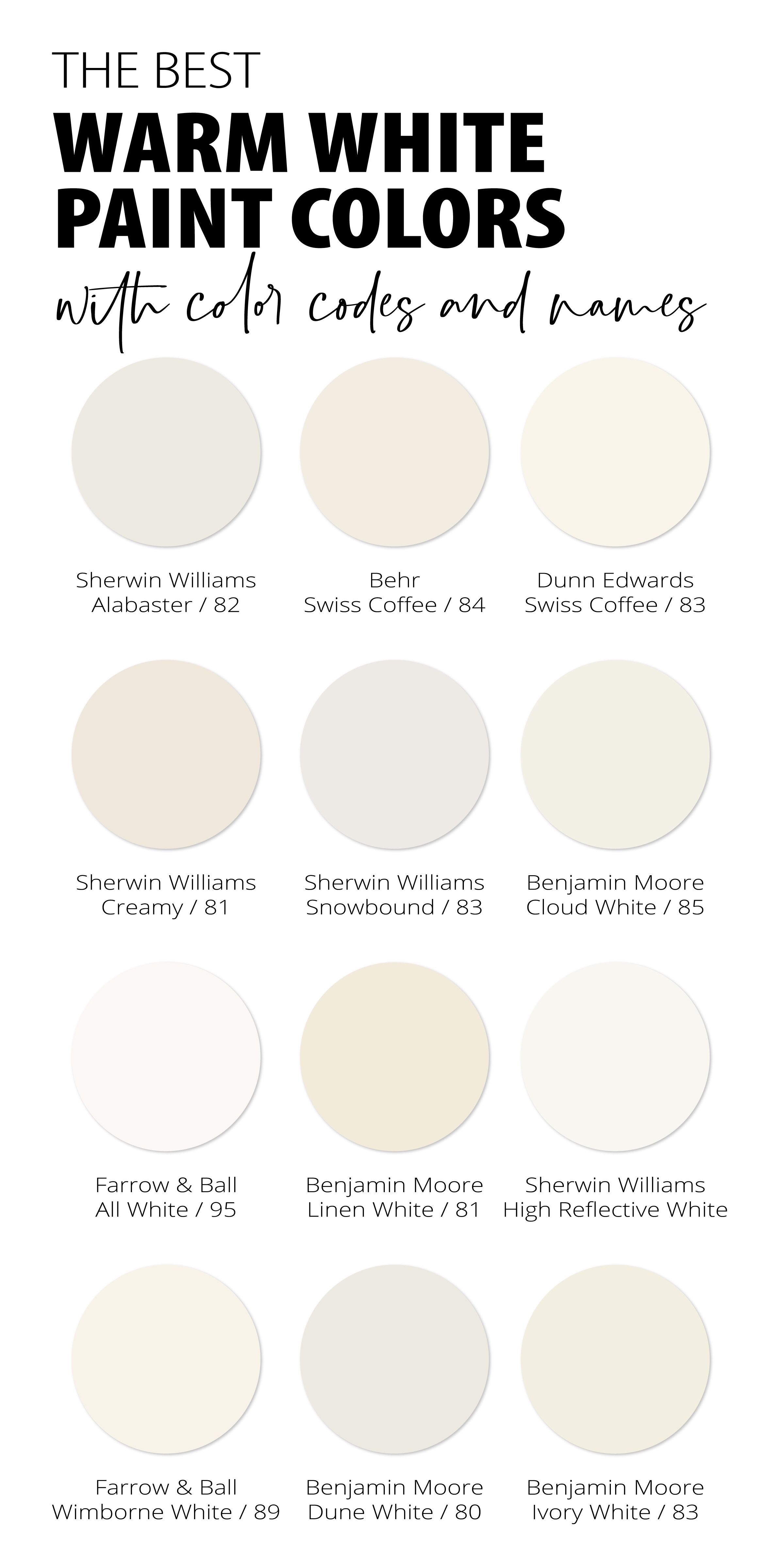
Every white paint color possesses a hidden DNA dictated by its colorants—the drops of raw pigment stirred into the base white at the tinting machine. Master painters and color consultants look past the marketing names on the front of the swatch and dive straight into the technical data sheets. The most critical metric in this evaluation is the Light Reflectance Value, commonly known as LRV. Measured on a scale from zero to one hundred, LRV tells you how much light a paint color reflects back into a room. True absolute black sits at zero, while a blinding, light-absorbing optical white sits at one hundred.
Warm whites generally live in the comfortable middle-to-high tier, typically registering between an LRV of 75 and 90. If you drop below 75, you are stepping away from white and entering the territory of true light creams or pale beiges. If you push past 90, you risk blinding glare and a cold, sterile ambiance that strips a room of its architectural intimacy. Understanding LRV prevents catastrophic lighting mistakes, particularly in spaces with compromised or directional natural light.
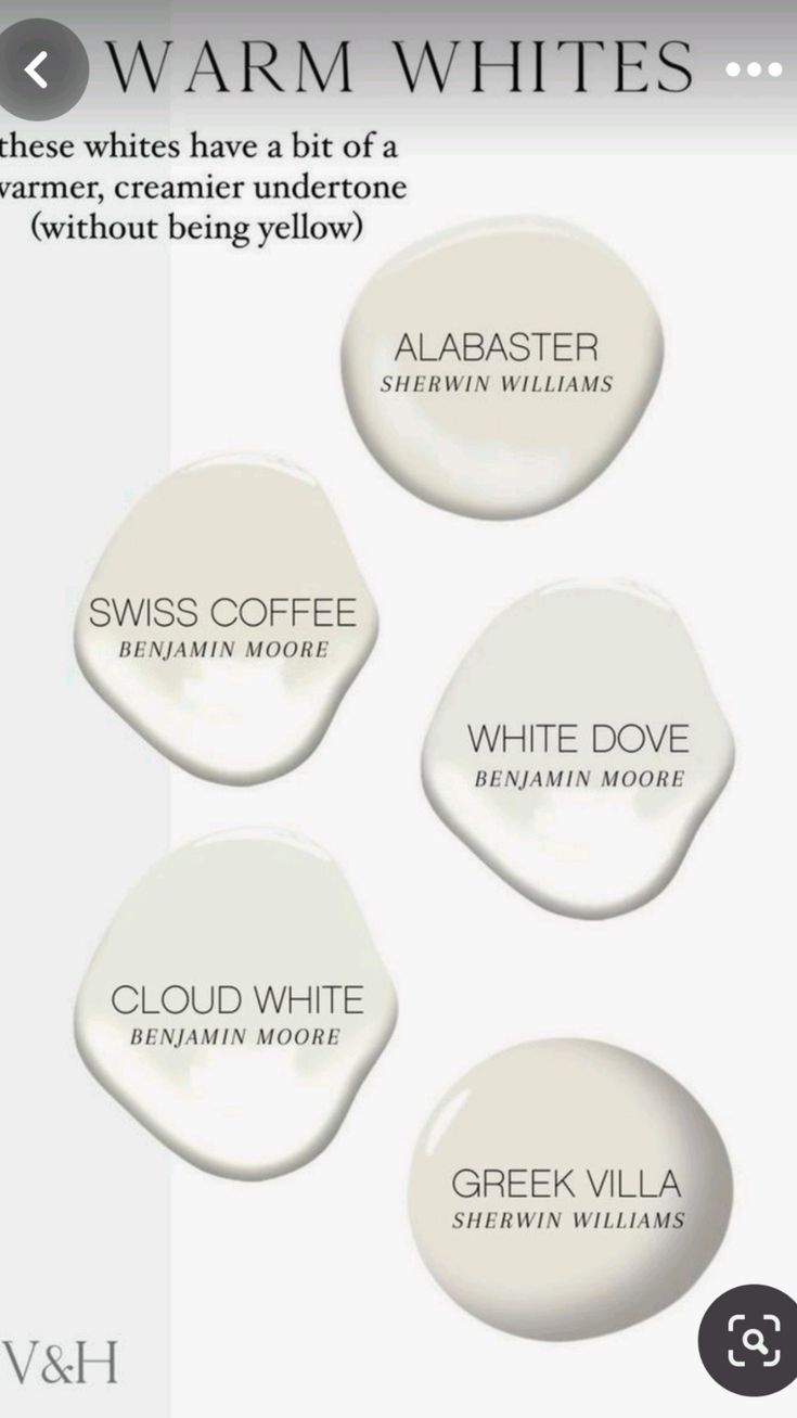
Beneath that reflectance percentage lies the true wild card: the undertone. Warm whites derive their inviting character from minute drops of yellow, red, orange, or raw umber. These secondary pigments are what prevent the paint from looking like hospital tile. However, they are also what causes a color to clash violently with your existing finishes. A warm white infused with heavy yellow undertones will instantly expose the cool gray veining in a stark Carrara marble countertop, making the stone look dirty or bruised by comparison.
Mapping out your space before opening a paint can requires cataloging every fixed element in the room. Hardwood species dictate undertone compatibility far more than furniture does. Red oak floors naturally throw a warm, pinkish-orange glow that will amplify yellow-based whites into butterscotch territory. White oak, particularly when finished with a neutral, non-yellowing sealer, offers a cleaner slate that can handle slightly crisper, creamier whites without visual competition.

Analyzing Spatial Dynamics and Environmental Light Behavior
Light is not a static constant; it is a volatile variable that shifts dramatically depending on geographical orientation and time of day. A north-facing room in a northern hemisphere climate receives indirect, cool, and often bluish light for the majority of daylight hours. If you throw a crisp, stark white or a cool gray-white into a north-facing study, the space will immediately feel cavernous, unwelcoming, and chilly. Here, you need a heavy-hitting warm white loaded with rich golden or amber undertones to actively fight back against the chill of the natural light.
Conversely, south-facing rooms are flooded with intense, golden, direct sunlight for hours on end. Putting a high-yellow warm white in a south-facing living room is a recipe for visual sensory overload. By mid-afternoon, the walls will appear aggressively butter-yellow rather than a sophisticated soft white. In these sun-drenched environments, you want a balanced warm white with a touch of gray or subtle taupe in the background to ground the blinding intensity of the sunbeams and keep the atmosphere calm.
East-facing and west-facing rooms present a dramatic daily shift that requires careful calibration. East-facing bedrooms catch the crisp, clear, slightly blue light of early morning, only to plunge into shadow by afternoon. West-facing spaces remain dim and sleepy until the late afternoon, when they explode with the fiery, orange-red hues of sunset. Choosing a warm white for these transitional spaces means finding a chameleon color—one that holds its own in the morning shadows without turning neon when the evening sun hits the glass.
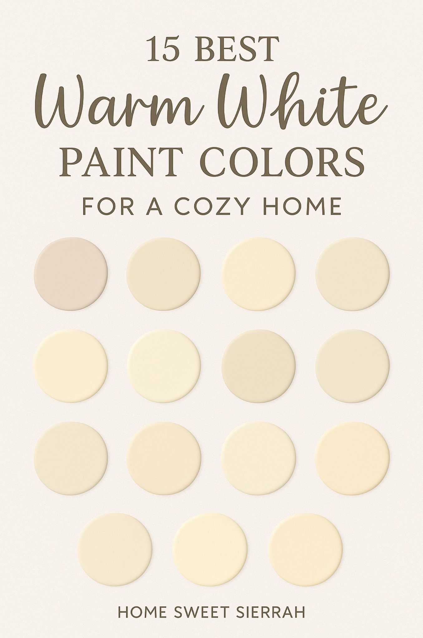
Architectural style and historical period also dictate how warm white behaves on a surface. Ornate Victorian moldings, deep crown profiles, and heavy wainscoting catch light at various angles, creating natural gradients of shadow and highlight. A complex warm white with depth will accentuate these shadows with subtle, beautiful contrast, whereas a cheap, flat white will make intricate millwork look muddy and obscure the craftsmanship.
A Field-Tested Methodology for Sampling and Testing Paint
Selecting paint colors from a tiny paper swatch is one of the most common causes of renovation regret. Paper absorbs light differently than a dried, multi-layered acrylic film on a textured wall. Professional designers never rely on a quick glance at a store display card. Developing a rigorous, repeatable testing protocol ensures that the color you fall in love with on day one is the exact color you can live with for the next decade.
Navigating Common Pitfalls and Practitioner Workarounds
Even experienced designers occasionally misjudge how a paint color will react once it covers four walls and a ceiling. The transition from a tiny square on a fan deck to an expansive, enveloping room surface amplifies every subtle characteristic of the pigment. Being aware of the most frequent traps allows you to course-correct before committing hundreds of dollars in labor and materials.
The Economic and Psychological Value of Cohesive Interior Palettes
Choosing a cohesive warm white paint scheme is not merely an aesthetic choice; it is an investment in spatial psychology and long-term property value. The color of our interior environment exerts a profound, subconscious influence on our daily stress levels, cognitive focus, and emotional well-being. Clinical spaces and harsh, ultra-cool whites trigger a physiological alertness that can border on anxiety when experienced for prolonged periods. Warm whites, by contrast, mimic the gentle, organic tones found in nature—unbleached cottons, raw linens, warm limestone, and aged plaster.
From a real estate perspective, a well-executed warm white interior acts as a powerful financial asset. When preparing a home for the market, buyers want a clean slate that feels upscale, inviting, and move-in ready. Stark white can feel cold and unapproachable, alienating buyers who are trying to visualize their lives in the space. A sophisticated warm white whispers quality and timelessness, bridging the gap between historical character and modern minimalism without feeling dated or overly rustic.
Related Posts
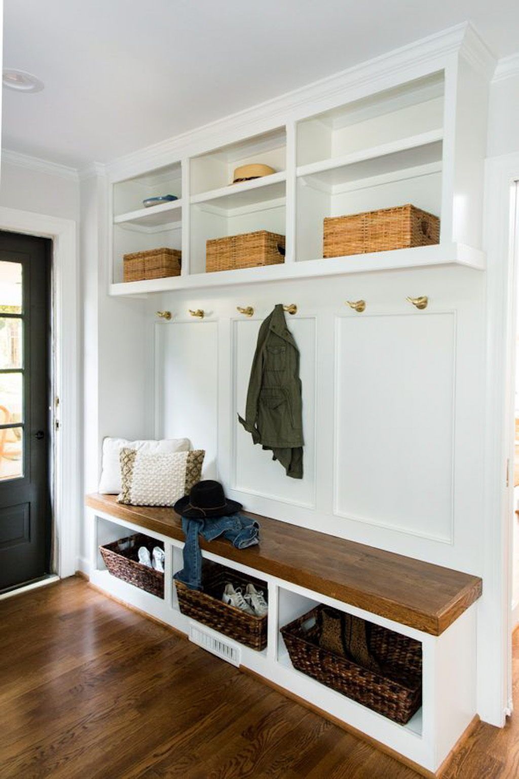
Real Solutions for Organizing Entryways and Mudrooms Without Losing Your Sanity
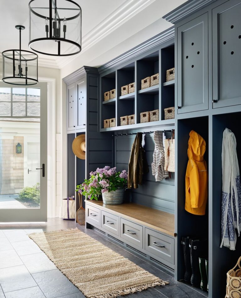
How to Design Mudroom Storage That Actually Keeps Your Family Organized
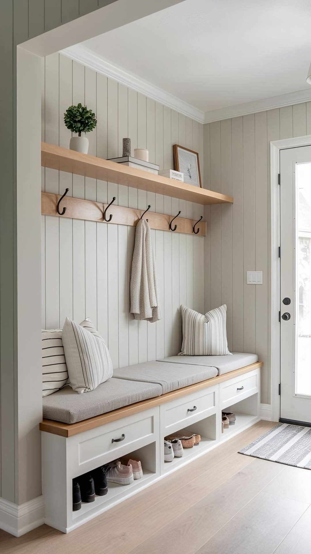
What Years of Home Design Interviews Taught Me About Choosing a Mudroom Storage Bench

Why interior designers recommend Halloween doorway curtains for effortless seasonal decorating

Designing a Seasonal Fall Table Setup Using Foraged Elements and Everyday Dinnerware

How to Blend Different Decor Aesthetics Without Making Your Rooms Look Cluttered
Furthermore, maintaining a consistent warm white palette throughout an entire home creates a continuous flow that maximizes the perceived square footage of the property. When the eye travels from the entryway down the hallway and into the living room without hitting jarring color interruptions, the boundaries of the home expand. Rooms feel larger, ceilings feel higher, and the architecture reads as a unified, intentional design rather than a collection of disjointed boxes.
Sustainability and material longevity also play a role in this design philosophy. High-quality mineral and acrylic paints formulated with low-VOC (volatile organic compounds) technologies mean that achieving a luxurious warm white no longer requires sacrificing indoor air quality. Selecting durable, scrubbable formulations ensures that your investment survives the inevitable scuffs of daily life, reducing the need for premature repainting and minimizing material waste over the life of the building.
Strategic Recommendations for Selecting Your Ideal Warm White
Synthesizing years of field trials and project management into an actionable framework requires boiling down the decision-making process into clear, logical steps. When you stand at the paint counter ready to make your selection, use this curated checklist to guide your final choice of formulation and finish.
Embarking on a painting project using warm white is an exercise in restraint and nuance. It is an acknowledgment that true sophistication rarely shouts; instead, it whispers through carefully calibrated undertones, perfect sheen pairings, and an intimate understanding of how light moves through architecture. By slowing down the selection process, respecting the physics of spatial orientation, and testing rigorously under real-world conditions, you eliminate the guesswork that causes so much renovation stress.
The walls of your home form the backdrop of your daily life, framing everything from quiet morning coffees to lively evening gatherings. When you get the warm white right, the entire space seems to exhale. The rooms feel larger yet cozier, the architectural details snap into focus, and the environment supports a sense of calm and well-being. Trust your testing process, respect the hidden power of undertones, and enjoy the transformation of your living space into a timeless sanctuary.
