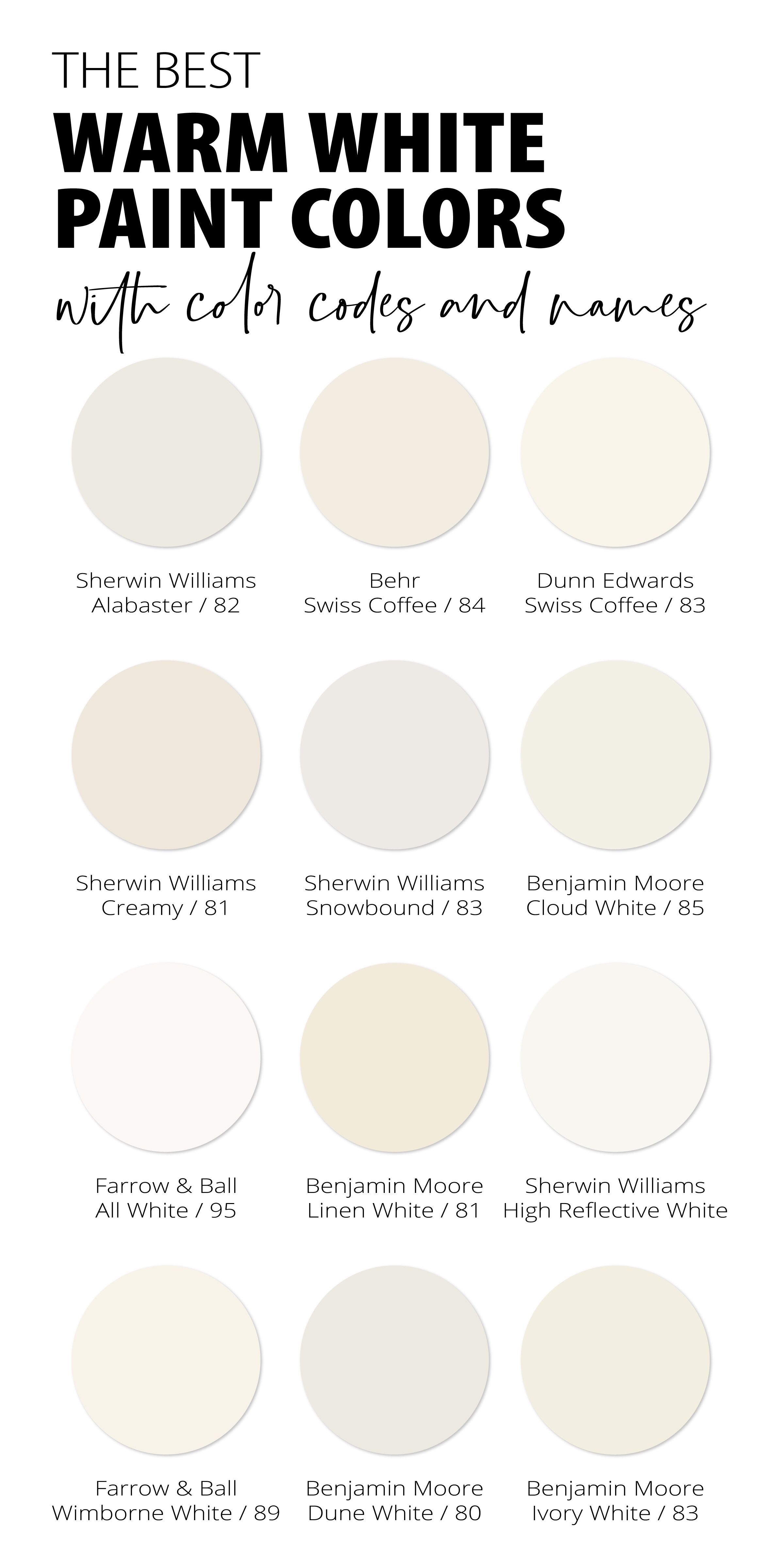
Standing in the lighting aisle of a high-end architectural showroom, holding two supposedly identical 3000K retrofit downlights, I watched a master electrician scratch his head. One fixture cast a buttery, inviting glow that made the white oak millwork sing with golden undertones; the other beamed with a stark, slightly clinical glare that felt more like a dentist's office than a residential living room. Both boxes proudly advertised "warm white." Both claimed identical lumen outputs. Yet, they lived in entirely different visual universes. This common mismatch exposes a fundamental truth about illumination: white light is never just white.
To understand what color a warm white light actually is, you have to throw out the assumption that white is a singular, unchanging point on a color wheel. White light is a dynamic cocktail of spectral wavelengths, measured not in paint pigments, but in degrees Kelvin. When we label a light source as "warm," we are borrowing vocabulary from physics and art to describe a color temperature that mimics the comforting, amber-rich emissions of incandescent filaments, candlelight, and the setting sun. Grasping this concept requires looking past marketing buzzwords and diving straight into the physics of color science.
For over a decade specifying luminaires for high-end residential renovations and boutique hospitality spaces, I have watched clients chase an elusive "cozy ambiance" only to end up with living rooms that look like operating theaters or bedrooms that feel dingy and yellow. The confusion stems from a lack of standardization in how manufacturers label color appearance, combined with the way human biology reacts to spectral distribution. When you peel back the layers of color rendering indexes, Planckian loci, and metamerism, you begin to see that warm white is not a single color at all—it is a carefully calibrated band of visual warmth that tricks our eyes into feeling safe, relaxed, and at home.

Deconstructing the Kelvin Scale and Spectral Power Distribution
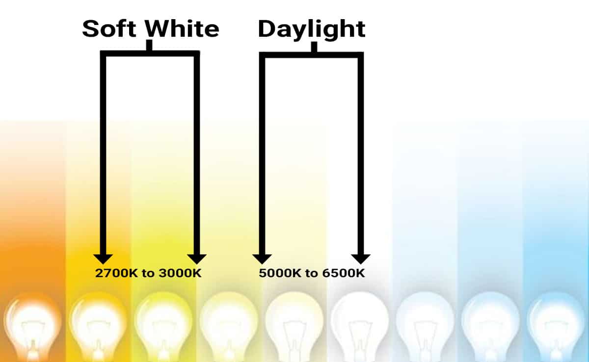
The absolute foundation of understanding warm white begins with the Kelvin ($K$) temperature scale, which runs counterintuitive to everyday human experience. In physics, when a hypothetical blackbody radiator is heated, it shifts through a predictable sequence of colors. Lower temperatures yield warmer, redder, and yellower hues, while higher temperatures push the spectrum toward cool blues and stark whites. Warm white typically occupies the lower end of the domestic lighting spectrum, generally spanning from 2400K to 3000K, though some specialized retrofit lamps push down to a cozy 2200K "candlelight" dimming profile.
At 2700K—the gold standard for residential coziness—the spectral power distribution (SPD) leans heavily into the longer wavelengths of the visible light spectrum. You get a rich concentration of reds, oranges, and yellows, with a relative scarcity of blue light. This spectral makeup is precisely why warm white feels soft to the human eye. Blue light wavelengths are short, highly scattering, and stimulating to the human brain's intrinsically photosensitive retinal ganglion cells, which regulate circadian rhythms. Warm white, by contrast, lowers our physiological guard, signaling to the nervous system that the sun is setting and it is time to unwind.
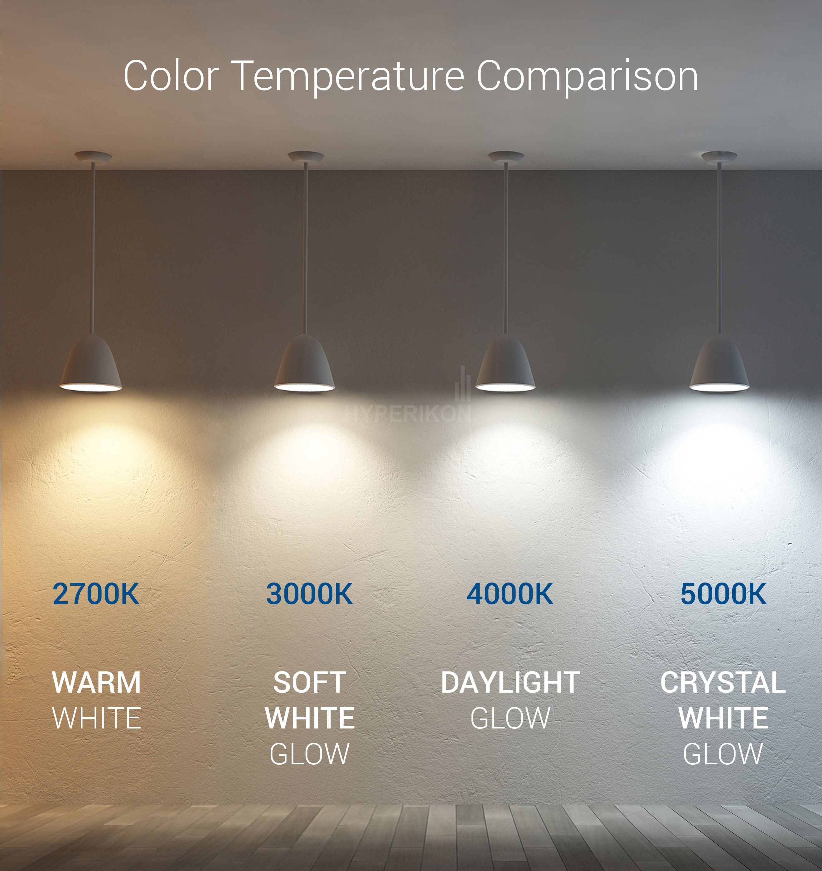
However, relying solely on the Kelvin number is a trap that catches many DIY designers and even seasoned builders. Two bulbs can both be rated at 3000K yet look entirely different because of their Spectral Power Distribution curves and how smoothly they cover the entire visible spectrum. Early-generation LEDs achieved 2700K by taking a sharp blue diode and slapping a heavy yellow phosphor coating over it, resulting in a spiky spectrum that left fabrics looking washed out and skin tones appearing sickly or greenish. Modern high-end LEDs utilize multi-phosphor blends or violet-pumped chips to fill in those spectral gaps, delivering a warm white that feels genuinely rich and full-bodied rather than artificially tinted.
The Human Element: Psychology, Biology, and Perception of Warm White
Color is not just a physical property of light waves hitting an object; it is a neurological interpretation constructed entirely inside the human brain. When we ask what color warm white is, we must account for how our biological adaptation systems process our visual environment. If you step outside at high noon under a 6500K overcast sky, your eyes adapt to that cool, blue-heavy daylight. Coming inside into a 2700K room immediately floods your retinas with long-wavelength light, making the interior feel profoundly golden, rich, and intimate.

This psychological anchoring is deeply rooted in evolutionary history. For millennia, humanity's only sources of artificial illumination after dark were fire, oil lamps, and tallow candles—all of which output light hovering between 1500K and 2200K. Our brains are hardwired to associate these warm, amber tones with safety, community, hearth, and rest. When an interior designer specifies 2700K warm white for a dining room or a boutique hotel lobby, they are not merely decorating; they are tapping into a primal neurological cue that encourages lingering, conversation, and relaxation.
Yet, this psychological affinity introduces a major design challenge: color contrast and spatial context. A warm white that looks gorgeous in a dimly lit, rustic cabin with exposed timber and leather will often look muddy, dingy, and suffocating inside a modern minimalist apartment outfitted with stark white walls and polished concrete floors. The surrounding reflectance values play an enormous role in how warm white is perceived. Bright white walls act as giant reflectors, bouncing those warm photons around the room and amplifying the yellow or peach undertones. Understanding this interplay prevents the common mistake of choosing a warm white light simply because it looks good on a sample board, only to find it turns the living room walls the color of butterscotch.
Methodical Approach to Selecting and Layering Warm White Lighting
Achieving a cohesive, professional-grade lighting scheme using warm white requires a disciplined, step-by-step methodology. You cannot simply swap out every bulb in a house for 2700K LEDs and expect a harmonious result. Lighting must be curated based on room function, ceiling height, and surface finishes.
Avoiding Common Pitfalls in Warm White Specification
Even experienced designers occasionally fall into traps when specifying warm white illumination. The lighting market is saturated with cheap products that misrepresent their color characteristics, leading to costly redesigns and mismatched rooms.

The Broader Impact: Circadian Health, Sustainability, and Architectural Evolution
Lighting is no longer viewed merely as a utility designed to let us see in the dark; it is now recognized as a powerful biological and psychological medium. The widespread adoption of energy-efficient solid-state lighting has given us unprecedented control over the color spectrum, sparking a revolution in human-centric design. Warm white is no longer just an aesthetic preference—it is a vital tool for safeguarding human circadian health in an era of constant blue-light exposure from screens and office environments.
From an economic and sustainability standpoint, the evolution of warm white LED technology represents a massive leap forward. Early LEDs forced a painful compromise: homeowners and architects had to choose between the brutal efficiency of harsh, cold-blue lighting or the high energy consumption and short lifespans of incandescent bulbs. Today, premium warm white LEDs deliver exceptional luminous efficacy while maintaining high color fidelity, drastically reducing energy consumption in commercial and residential sectors alike. This technological maturity means we no longer have to sacrifice atmosphere for efficiency.
Looking forward, the architectural lighting industry is moving rapidly toward dynamic, tunable-white systems that automatically shift color temperature throughout the day. These systems start with a crisp, cool white in the morning to support alertness and focus, gradually transitioning through neutral tones, and finally settling into a rich, deeply soothing warm white in the evening hours. Understanding what color warm white is today serves as the foundational stepping stone for mastering these advanced lighting controls, empowering designers and homeowners to sculpt spaces that honor both human biology and architectural beauty.
Strategic Frameworks for Harmonizing Warm White Environments
To ensure your lighting design maintains visual integrity across different zones of a building, it helps to implement a structured framework that guides your fixture selection from blueprint to installation.
Mastering the true nature of warm white light is an ongoing pursuit that bridges art, physics, and human biology. It forces us to look past simplistic color labels and engage deeply with the technical nuances of spectral distribution, color rendering, and spatial context. When you get it right, warm white does something magical: it stops calling attention to itself and instead allows architecture, materials, and human connection to take center stage.
As lighting technology continues to evolve, our ability to manipulate color temperature with precision will only improve. Yet, the core human desire for warmth, comfort, and sanctuary will remain entirely unchanged. By approaching lighting specification with rigorous curiosity, technical literacy, and a deep respect for human perception, you can transform ordinary rooms into extraordinary environments that feel precisely, wonderfully right.