Ah, beige. Often dismissed as 'boring' or 'safe,' this humble hue holds a surprising depth and versatility, especially when it comes to upholstery. But here's the rub: not all beiges are created equal. The true magic, and sometimes the true frustration, lies in its undertones. As someone who's spent decades immersed in the world of fabrics and interiors, I can tell you, overlooking these subtle color currents is one of the biggest mistakes people make when selecting furniture for their homes. It's like trying to find the perfect melody without hearing the bassline – you're missing a crucial component.
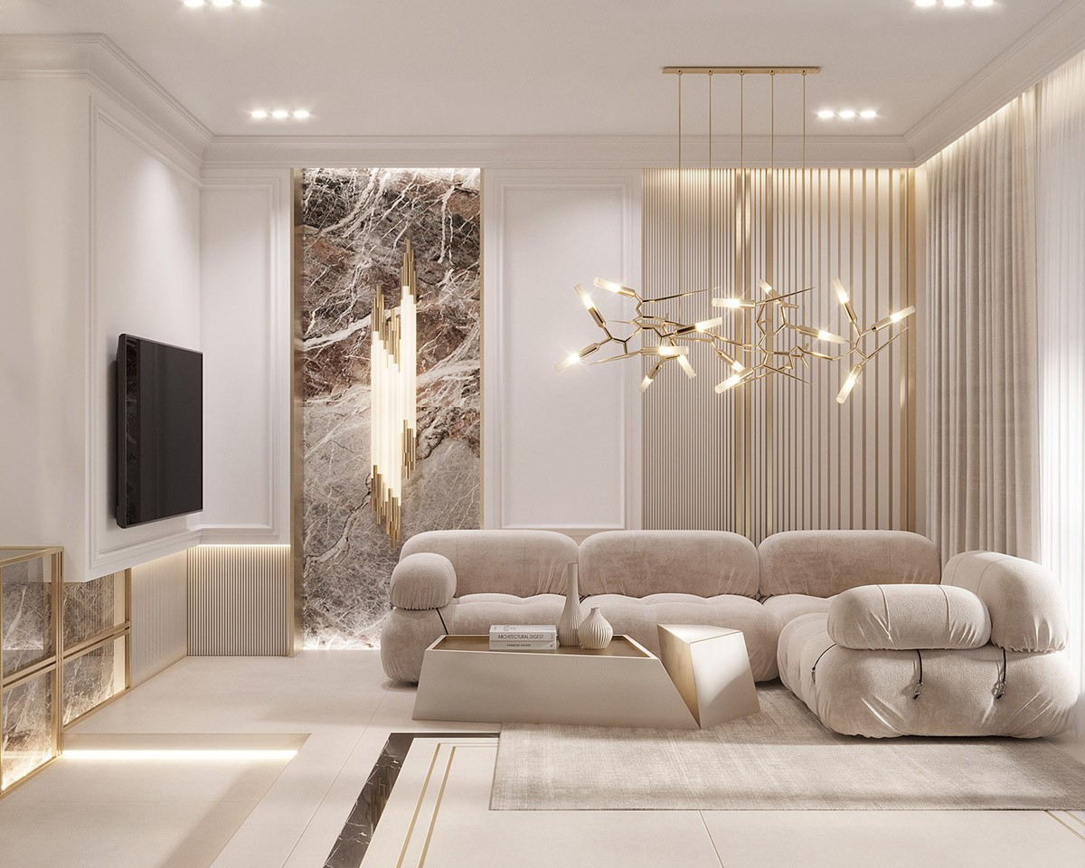
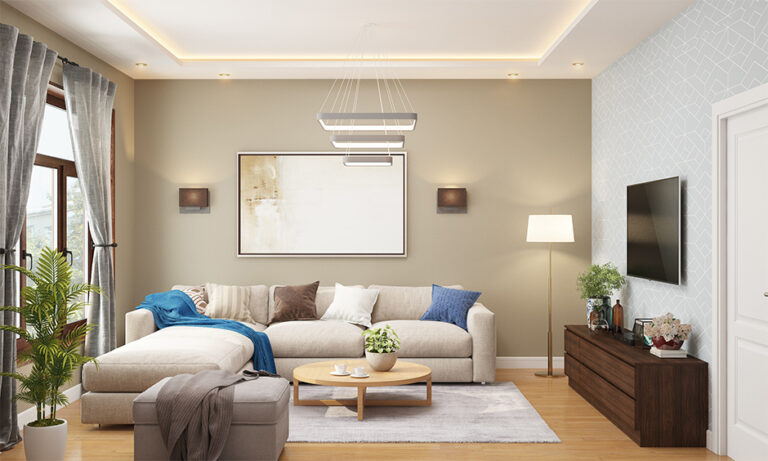
Light beige. It’s a popular choice for upholstery, and for very good reason. It offers a sense of calm, a feeling of spaciousness, and a wonderful foundation for almost any design scheme. It's a chameleon, truly. But its very adaptability is also its biggest challenge. Many a homeowner has brought home a beautiful light beige sofa, only to find it clashes with their walls, their rug, or even their natural light. Why, you ask? The answer, my friends, is undertones. These are the underlying colors that give a beige its unique character, dictating whether it leans warm, cool, or even a bit murky. Getting this right is not just about aesthetics; it's about creating a truly cohesive and inviting atmosphere in your personal sanctuary. Let's delve into this fascinating world of color, shall we?
What Exactly Are Undertones, Anyway?
Let's strip away the jargon and make this simple. Imagine a painter mixing paint. They start with a base color, say, white. Then, to create a subtle variation, they add a tiny drop of another color – perhaps a smidgen of yellow, a hint of gray, or a touch of pink. That tiny drop, that underlying tint, is the undertone. In light beige upholstery, these undertones are what differentiate one 'beige' from another. It's the reason why a 'greige' looks different than a 'cream' even though both might be called 'light beige.' Understanding this fundamental concept is your first step towards becoming an undertone whisperer.
The Big Three: Warm, Cool, and Neutral Undertones
When we talk about undertones in light beige, we primarily focus on three main categories, and recognizing them is key to making a brilliant choice.
- Warm Undertones: Think sunshine, sand, and caramel. These beiges will have hints of yellow, gold, orange, or even red. They feel cozy, inviting, and often work beautifully in rooms with natural wood tones or a more traditional aesthetic. A light beige with a strong yellow undertone might be called 'cream' or 'ivory.'
- Cool Undertones: Picture misty mornings, stone, and gentle shadows. These beiges will have traces of gray, green, blue, or even a touch of purple. They evoke a sense of calm, sophistication, and often pair well with modern or minimalist designs, as well as cool-toned wall paints. A light beige with a noticeable gray undertone is often referred to as 'greige.'
- Neutral Undertones: These are the trickiest, and sometimes the most versatile. A truly neutral beige has no discernible leanings towards warm or cool. It's a balanced blend, often with very subtle gray, brown, or even a hint of green that keeps it from falling into either extreme. These are the chameleons that can adapt to many environments, but they can also feel a bit 'flat' if not paired with other elements that provide warmth or coolness.
The Lighting Factor: How Light Plays Tricks on Your Beige
This is a big one, folks, and often overlooked! The type of light in your space profoundly impacts how the undertones of your light beige upholstery will appear.
- Natural Light: North-facing rooms often have cooler, bluer light, which can make warm beiges appear less vibrant and cool beiges feel even cooler. South-facing rooms, conversely, get warmer, yellower light, which can enhance the warmth of a beige. East-facing rooms get warm morning light and cooler afternoon light, while west-facing rooms get cool morning light and warm afternoon light.
- Artificial Light: Incandescent bulbs typically emit a warmer, yellowish light, which will pull out the warm undertones in your beige. LED lights vary widely; some are very cool (blue-white), others are neutral, and some are warm. Fluorescent lights are generally very cool and can make warm beiges look dull or even slightly green. Always, always look at your fabric swatch in the actual room where it will live, at different times of day, and under both natural and artificial lighting conditions. I can't stress this enough. A swatch can look perfect in the showroom but be a complete miss at home.
Harmonizing Your Hues: Pairing Beige with Your Existing Decor
Now for the fun part: making it all work together. The goal is harmony, not necessarily matching.
- Warm Beige Pairings: If your light beige has warm, sunny undertones, it will sing when paired with other warm colors like terracotta, rust, olive green, deep reds, or certain shades of blue (like a dusty navy). It also looks incredible with natural wood furniture, brass accents, and textured fabrics like linen and wool. Think about bringing in some warmth with decorative pillows or throws, maybe in a burnt orange or a rich gold.
- Cool Beige Pairings: For those cool-toned beiges, think about complementary cool colors. Shades of blue (from sky to deep indigo), cool greens (like sage or emerald), grays, and even some purples will look fantastic. Metals like chrome, brushed nickel, and black iron also complement cool beiges beautifully. Imagine a greige sofa with some deep teal cushions and a sleek, modern coffee table. Very chic.
- Neutral Beige Pairings: The beauty of a truly neutral beige is its versatility. It acts as a perfect canvas. You can introduce pops of color through accessories, artwork, and accent furniture. It allows other elements in the room to take center stage. This is where you can really play with textures and patterns, as the neutral base won't compete. Perhaps a neutral beige sofa with a vibrant abstract painting above it and some patterned throw pillows.
The Swatch Strategy: Your Secret Weapon Against Undertone Blues
This is where the rubber meets the road. Don't just pick a beige from a picture online or a tiny sample. Get a large swatch, ideally 12x12 inches or bigger.
- Bring it Home: This is non-negotiable. You need to see the fabric in your space.
- Observe in Different Lights: As discussed, look at it morning, noon, and night. Turn on and off your lamps. See how it shifts.
- Compare to Existing Elements: Place the swatch directly next to your wall paint, your flooring, your rug, and any large existing furniture pieces. Does it blend? Does it clash? Does it enhance?
- Consider Adjacent Rooms: If your living room flows into a dining room or kitchen, think about how the beige will look from that perspective, too. A harmonious flow is key to a well-designed home.
- Trust Your Gut (and Your Eyes): Sometimes, you just know when something feels right. If it looks off, it probably is. Don't force it.
Beyond Beige: The Psychology of Color in Your Home
Choosing the right beige isn't just about matching colors; it's about setting a mood, creating an atmosphere, and influencing how you feel in your own home. Light beige, when its undertones are correctly understood and harnessed, offers a foundation for tranquility, warmth, or sophisticated calm. A warm beige can make a large, open space feel more intimate and inviting, while a cool beige can bring a sense of crispness and modernity to a smaller, cozier area. It's about crafting an experience. Don't underestimate the power of these subtle shifts. They are the silent architects of your interior comfort and style. It's a nuanced dance, and once you learn the steps, you'll be able to choreograph truly beautiful spaces.
So, there you have it. Light beige upholstery, far from being a simple or bland choice, is a rich and complex world of subtle color. Understanding its undertones – whether warm, cool, or neutral – is not just an interior design trick; it's an essential skill for creating a truly harmonious and inviting living environment. By paying attention to the nuances of light, carefully comparing swatches in your own space, and considering how these undertones interact with your existing decor, you can transform a potentially tricky decision into an opportunity for design excellence. Embrace the subtle power of beige, and watch your space come alive with understated elegance and perfect balance. It’s a rewarding journey, and one that will bring lasting beauty to your home. Happy decorating!