Ever walked into a room and instantly felt a sense of peace wash over you? Or perhaps another space made you feel a little on edge, though you couldn't quite pinpoint why. More often than not, these feelings are deeply connected to the colors that surround us. Interior design isn't just about aesthetics; it's about creating an atmosphere, a feeling, and a sanctuary. And at the heart of this lies the subtle, yet potent, influence of color psychology. Let's dive into how the hues we choose for our walls, furniture, and decor can dramatically shape our emotional landscape and cultivate a profound sense of calm.
We often think of color as a way to express personal style or make a room look appealing. But there's so much more going on beneath the surface. Color has a direct line to our emotions and our physiological responses. It’s a language that our brains understand intuitively. For centuries, artists and designers have intuitively used color to evoke specific feelings, but modern psychology is now providing concrete evidence for these connections. Understanding these principles can help you transform your living spaces from mere decorations into havens of tranquility and rejuvenation. Ready to explore how a splash of blue or a touch of green can truly change your home – and your state of mind?
The Science of Serenity: How Colors Speak to Our Brains
It might sound a bit mystical, but there's real science behind why certain colors make us feel a certain way. Our brains process color signals, and these signals can trigger the release of hormones and neurotransmitters that affect our mood and energy levels. For instance, warm colors like reds and oranges can increase heart rate and stimulate the nervous system, making us feel more energized but potentially agitated. On the flip side, cool colors, such as blues and greens, tend to have a calming effect. They can slow down our heart rate and breathing, promoting relaxation and a sense of peace. Think about it: when you look at a vast blue sky or a lush green forest, don't you naturally feel a sense of calm? This isn't a coincidence. These colors are deeply ingrained in our evolutionary past as symbols of stability and nature, and our brains are wired to respond to them positively.
Cool Tones: The Architects of Tranquility
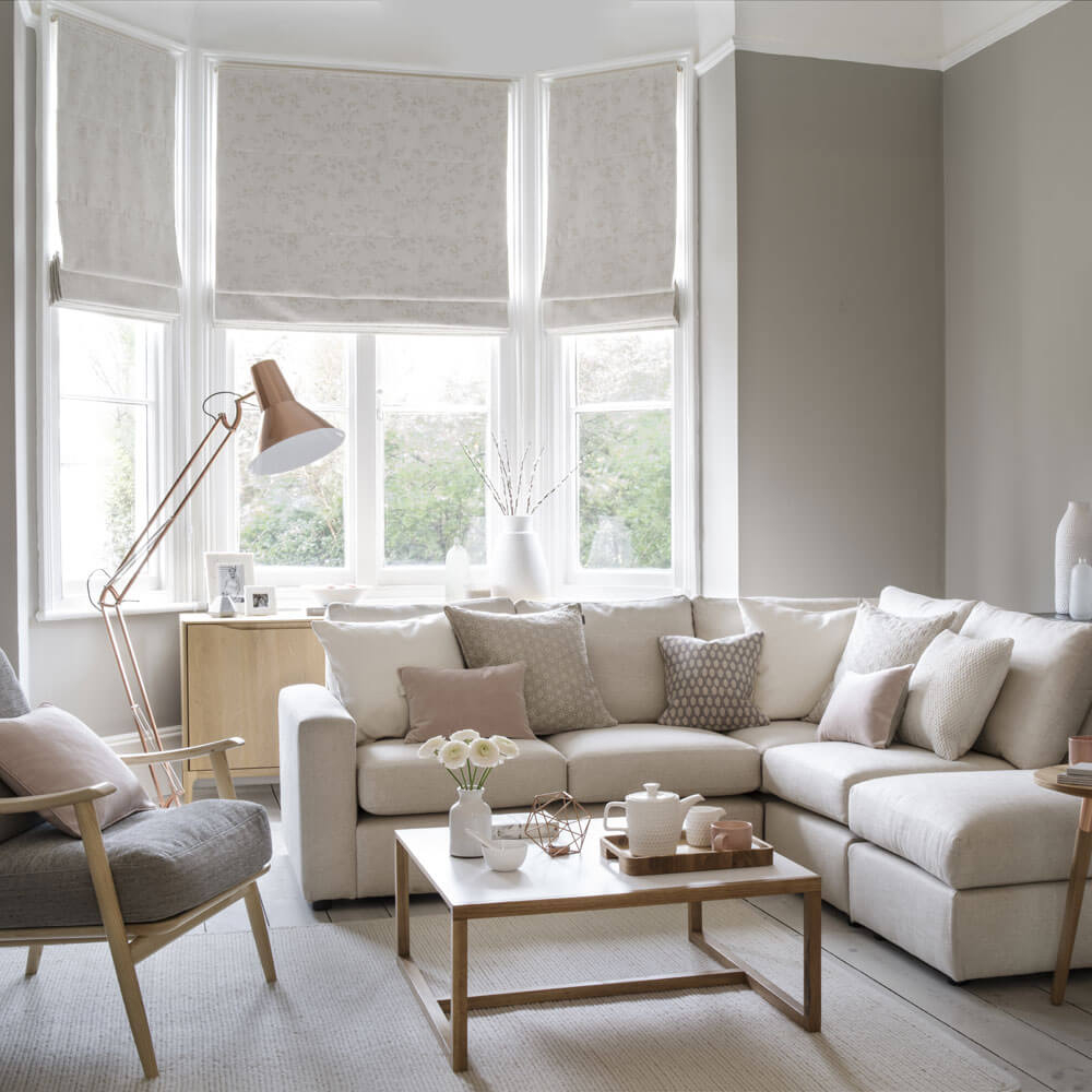
When the goal is to cultivate calm, the cool color palette is your best friend. Blues, in particular, are renowned for their ability to reduce stress and promote a sense of serenity. Light blues can evoke feelings of openness and peace, making them ideal for bedrooms and living areas where relaxation is paramount. Think of a soft, sky-blue accent wall or a deep navy throw pillow. Greens are another powerhouse for creating a tranquil environment. They are closely associated with nature, growth, and harmony, offering a soothing and grounding effect. A sage green kitchen or an emerald green armchair can bring the restorative power of the outdoors in. Even softer shades of purple, like lavender, can contribute to a peaceful atmosphere, often linked to spirituality and introspection.
Warm Hues: Used Wisely for Comfort and Coziness
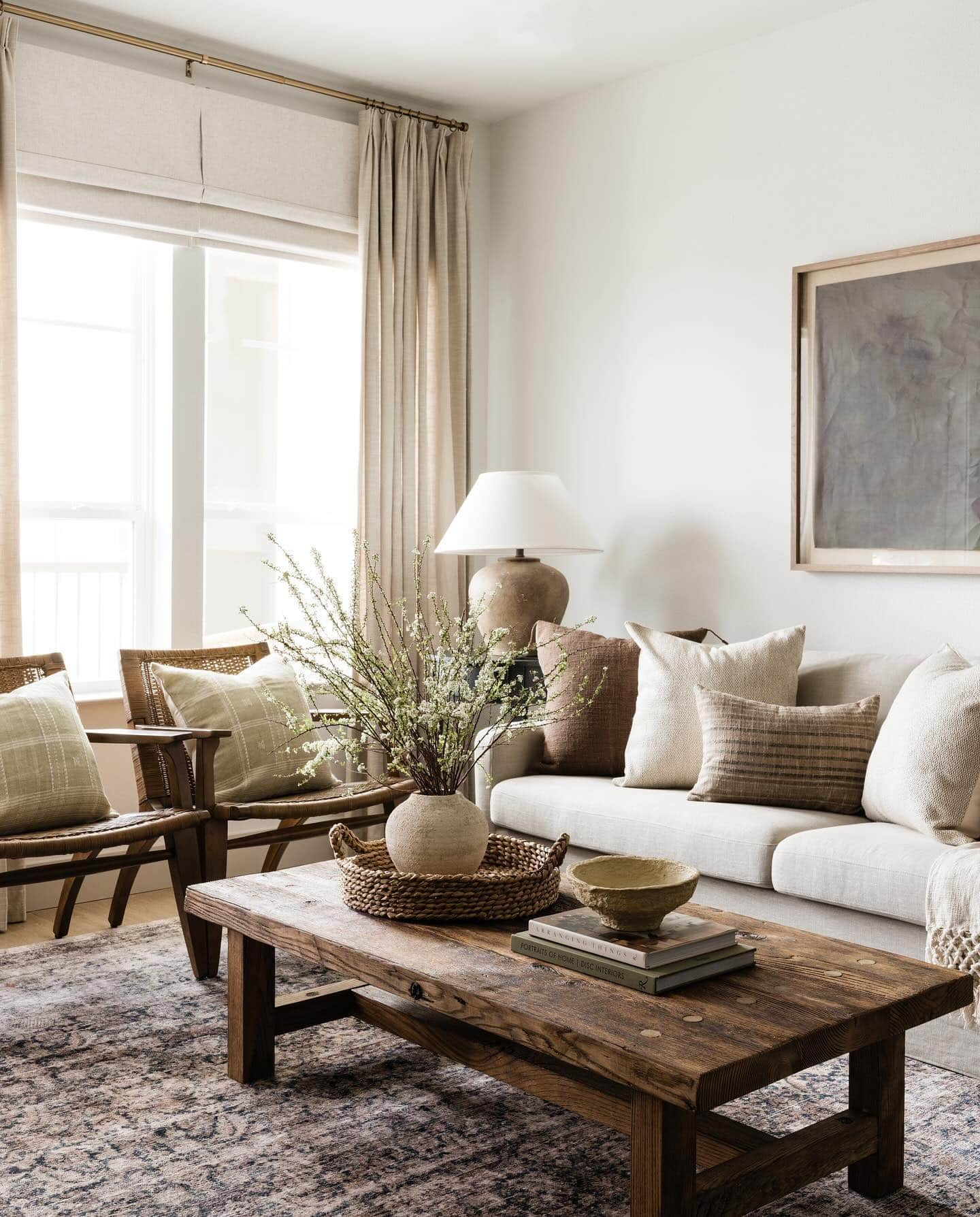
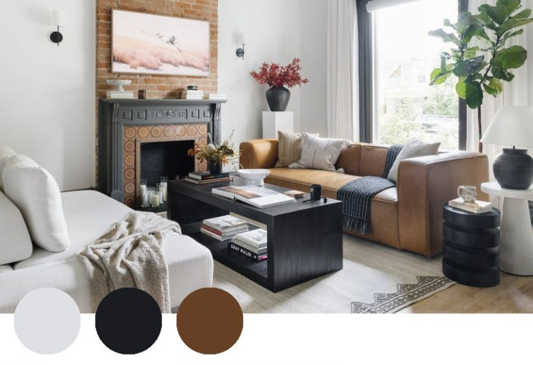
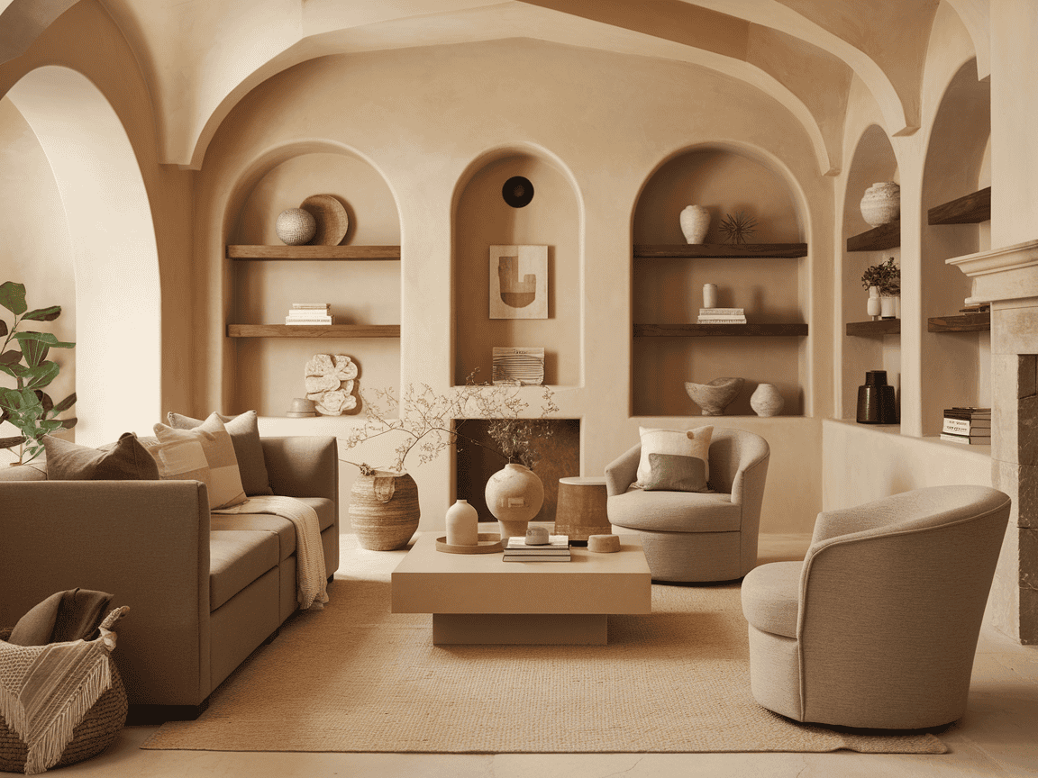
While cool colors are the go-to for pure calm, warm colors don't have to be off the table. They can be incredibly effective in creating a sense of comfort and inviting coziness, which is a crucial part of feeling at home and at ease. The trick is to use them thoughtfully and in moderation. Soft, muted tones of yellow can bring a gentle warmth and optimism to a space without being overwhelming. Think of a creamy yellow in a dining room to encourage pleasant conversation. Earthy tones like terracotta, ochre, and muted oranges can add a feeling of groundedness and warmth, especially when paired with natural materials. These colors can make a larger room feel more intimate and welcoming. A burnt orange accent in a living room, for example, can provide a cozy focal point.
Neutrals: The Foundation of Peaceful Design
Neutrals are the unsung heroes of calm interior design. They provide a sophisticated and versatile backdrop that allows other elements to shine while contributing to an overall sense of order and peace. Whites, off-whites, grays, and beiges offer a clean and uncluttered aesthetic. A crisp white can make a space feel larger and brighter, promoting clarity. Soft grays offer a sense of balance and neutrality, acting as a perfect canvas for accent colors or allowing for a minimalist, serene look. Warm beiges and creams add a touch of softness and warmth, preventing a neutral space from feeling sterile. The beauty of neutrals is their ability to layer. You can combine different shades and textures of neutral colors to create depth and visual interest without sacrificing the tranquil ambiance. They are the perfect starting point for any serene design scheme.
The Role of Light and Texture with Color
Color doesn't exist in a vacuum. Its impact is significantly influenced by light and texture. Natural light can dramatically alter how a color appears and how it makes you feel. A cool blue might feel invigorating in bright sunlight but might seem too cold in a dimly lit room. Conversely, a warm neutral might feel cozy and inviting with soft, ambient lighting. Texture plays a role too. A rough, natural texture like wood or stone can enhance the grounding qualities of earthy colors, while smooth, reflective surfaces can amplify the coolness of blues and greens. Consider how a plush velvet sofa in a deep teal will feel different from a matte finish in the same color. Combining calming colors with soft textures and appropriate lighting is key to maximizing their serene effects. It's about creating a harmonious sensory experience.
Practical Tips for Applying Color Psychology at Home
Ready to bring more calm into your home? Here are some actionable steps: Start small. If you're hesitant, begin with accent pieces like throw pillows, rugs, or artwork in calming colors. Consider the room's purpose. A bedroom might benefit from soft blues and greens, while a home office could use a touch of grounding green or optimistic yellow. Don't underestimate the power of white space. Sometimes, less is more. Avoid overwhelming a room with too many competing colors. Test colors. Paint swatches on your walls and observe them at different times of the day to see how the light affects them. Think about the overall mood you want to achieve. Do you want a space that feels airy and open, or cozy and intimate? The colors you choose are your primary tools for sculpting that feeling. And remember, personal preference matters. While these are general principles, your own positive associations with certain colors should also be considered.
The journey to a calmer home is often just a color choice away. By understanding the subtle yet profound impact of color psychology, you can intentionally design spaces that nurture your well-being and provide a true sanctuary from the outside world. It’s about moving beyond fleeting trends and embracing the enduring power of hues to shape our emotions and experiences. So, next time you're contemplating a change, pause and consider the colors. Let them be your guide in creating a home that not only looks beautiful but also feels wonderfully serene and deeply calming. Your personal oasis awaits.