We often hear about trends in interior design, but some elements are timeless. Warm color palettes, like those evoking the rich tones of amber, are a perfect example. They bring a sense of comfort, energy, and sophistication that’s hard to beat. Think about it – a room bathed in soft, golden light feels inherently more inviting, doesn't it? This approach isn't about creating a space that feels dated; it's about a contemporary interpretation of warmth that feels both luxurious and livable.
Imagine stepping into a space that instantly wraps you in a comforting embrace. That's the magic of a well-executed warm color palette. Inspired by the captivating glow of amber, this design philosophy focuses on hues that radiate warmth, like rich caramels, deep ochres, burnt siennas, and soft, golden yellows. It’s about creating an atmosphere that’s both energizing and serene, sophisticated and deeply personal. Forget sterile, minimalist spaces for a moment; let's explore how warm colors can transform your home into a sanctuary that feels alive and welcoming, a true contemporary take on timeless comfort.
Why Warm Colors Work Wonders
So, what makes warm colors so special? Scientifically, they're known to stimulate activity, encourage communication, and create a feeling of coziness. Think about how a crackling fireplace or a sunset can make you feel – that's the power of warmth. In interior design, these shades can make a large room feel more intimate, or add a much-needed sense of comfort to a smaller dwelling. They have a way of drawing people in, making a space feel more convivial and less formal. It’s about creating an emotional connection with your environment, and warm tones are masters at that.
The Amber Apartment Color Palette Explained
When we talk about the 'Amber Apartment' palette, we're not just talking about one shade of yellow. It’s a spectrum. Imagine the deep, translucent glow of real amber – that’s our starting point. This translates into a range of colors including:
- Golden Yellows: Not the bright, primary kind, but softer, more muted tones that feel sophisticated and natural.
- Caramels and Toffees: These rich, creamy browns add depth and a sense of groundedness.
- Burnt Oranges and Siennas: Think terracotta or the warm tones of autumn leaves. They bring an earthy, vibrant energy.
- Deep Ochres: A classic, versatile color that sits between yellow and brown, offering both warmth and a touch of elegance.
- Soft Terracottas: These provide a subtle, earthy blush and a welcoming feel.
The key is in the depth and richness of these hues. They’re not loud or overwhelming, but rather offer a continuous, soothing flow of warmth throughout the space.
Bringing the Warmth into Your Space: Practical Tips
Okay, so how do you actually do this without your home feeling like a giant pumpkin? It’s all about balance and thoughtful application.
Start with a Foundation
Consider using a warm neutral for your walls, like a creamy off-white or a very light beige with warm undertones. This provides a subtle base that allows your accent colors to shine. Alternatively, a soft, muted gold or a very light terracotta can be stunning as a main wall color in rooms where you want maximum coziness, like a den or bedroom.
Accent with Richness
This is where the 'amber' really comes to life. Introduce richer, deeper warm tones through:
- Upholstery: A velvet sofa in a deep caramel, or accent chairs in burnt orange.
- Rugs: A patterned rug with amber, ochre, and cream elements can anchor a room.
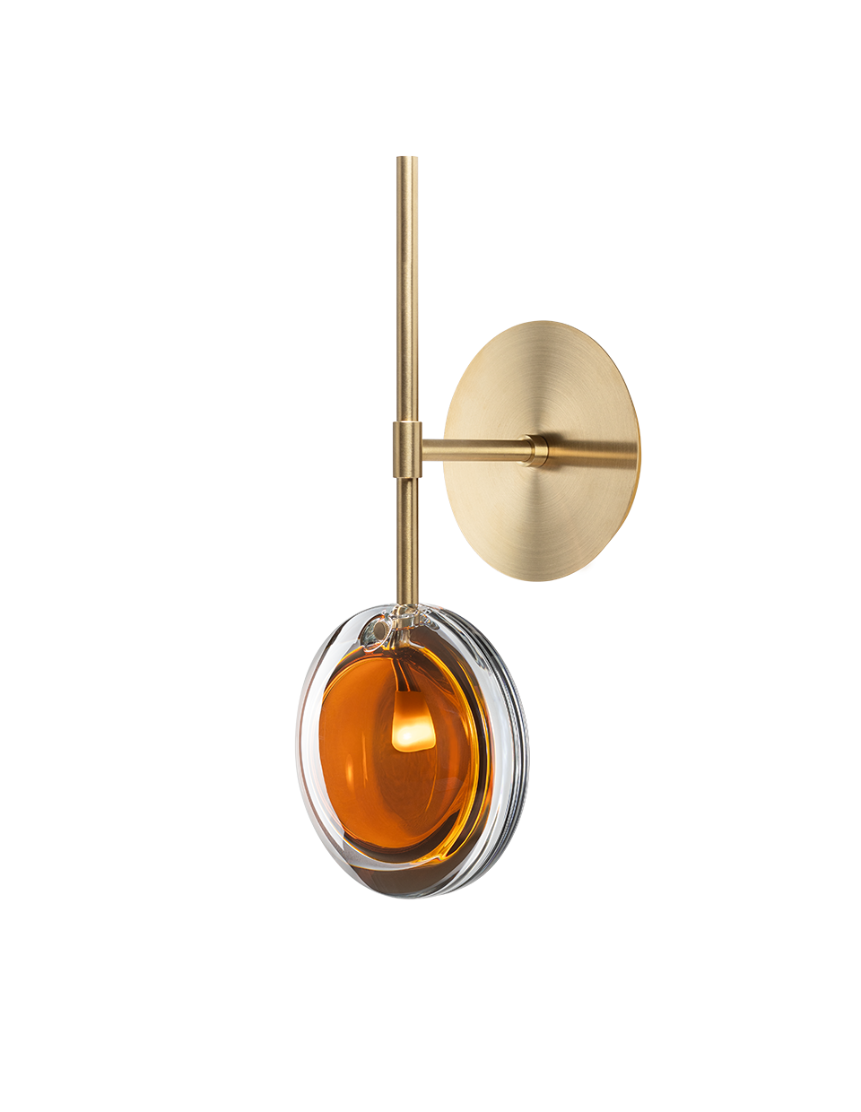
- Curtains: Drapes in a rich, warm hue can add a luxurious feel and control light beautifully.
- Artwork: Choose pieces that feature warm color palettes.
Material Matters
Natural materials inherently possess warmth. Think about incorporating:
- Wood: Furniture, flooring, or decorative accents in warm wood tones like walnut, oak, or teak.
- Leather: A classic leather armchair or ottoman adds instant warmth and character.
- Textiles: Use materials like wool, linen, and velvet in your warm color scheme. These fabrics have a tactile quality that enhances the cozy feel.
Lighting is Key
Warm colors respond exceptionally well to lighting. Opt for layered lighting – ambient, task, and accent lights. Use bulbs with a warm color temperature (around 2700K-3000K) to enhance the richness of your palette. Dimmers are your best friend here, allowing you to adjust the mood throughout the day and into the evening.
Balancing Warmth with Other Elements
While the focus is on warmth, it’s crucial to create harmony. A room that's too warm can feel heavy or even overwhelming. Here’s how to strike the right balance:
Introduce Cooler Tones Strategically
Don't shy away from cooler colors entirely. A few touches of deep navy, forest green, or even a slate grey can provide a beautiful contrast, making the warm tones pop even more. Think of these as grounding elements. They prevent the space from feeling monotonous.
Neutrals are Your Allies
Creamy whites, soft greys, and even black can act as sophisticated counterpoints. Use them in smaller doses – think a black metal lamp, a grey throw pillow, or a crisp white frame for artwork. They help to define the space and provide visual rest.
Texture, Texture, Texture!
This is perhaps the most critical element for a successful warm palette. Varying textures prevents the colors from feeling flat. Mix smooth surfaces (like a lacquered side table) with rougher, organic textures (like a jute rug or a chunky knit throw). This adds depth and visual interest, making the room feel more layered and inviting.
Common Pitfalls to Avoid
Even with the best intentions, it's easy to go a little off track. Here are a few things to watch out for:
- Going Overboard: Using too many saturated warm colors at once can be overwhelming. Remember, it’s about creating a feeling, not a circus.
- Ignoring Undertones: Not all yellows are created equal. Some can lean too green or too orange, which might clash with your intended palette. Pay close attention to the subtle undertones of your chosen paints and fabrics.
- Lack of Contrast: As mentioned, without some contrast, the room can feel flat or muddy. Ensure there are lighter and darker elements, and perhaps a few cooler tones, to provide definition.
- Bad Lighting: Harsh, cool lighting can completely kill the warm vibe you’re trying to create. Always consider your light bulbs and fixture types.
The Emotional Impact of Warm Spaces
Beyond aesthetics, the goal of a warm color palette is to foster a particular feeling. Spaces designed with these rich hues often promote relaxation and well-being. They can encourage conversation and connection, making them ideal for living areas, dining rooms, and even home offices where a bit of stimulating energy is welcome. It’s about creating a sanctuary, a place where you can unwind, recharge, and feel truly at home. When you walk into a room designed with intention and warmth, you can feel the difference. It’s a welcoming hug for the soul.
Designing with a warm color palette, as exemplified by the sophisticated approach of 'The Amber Apartment,' is about more than just decorating. It's about crafting an experience. By thoughtfully incorporating rich caramels, golden yellows, burnt oranges, and deep ochres, balanced with natural materials, varied textures, and strategic contrasts, you can transform your home into a space that feels both contemporary and timelessly inviting. It’s a journey of creating comfort, fostering connection, and building a personal sanctuary that truly resonates. So, go ahead, embrace the warmth, and let your home glow.