Thinking about minimalism? Often, it conjures images of stark white rooms, devoid of personality. But what if we told you that a minimalist space doesn't have to be boring? In fact, it can be incredibly dynamic and inviting. The secret? Mastering the art of using 'pops of color'. It’s about intentionality, about choosing where and how to inject vibrancy without overwhelming the calm. Let's explore how to make your minimalist sanctuary sing with personality.
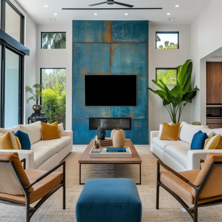
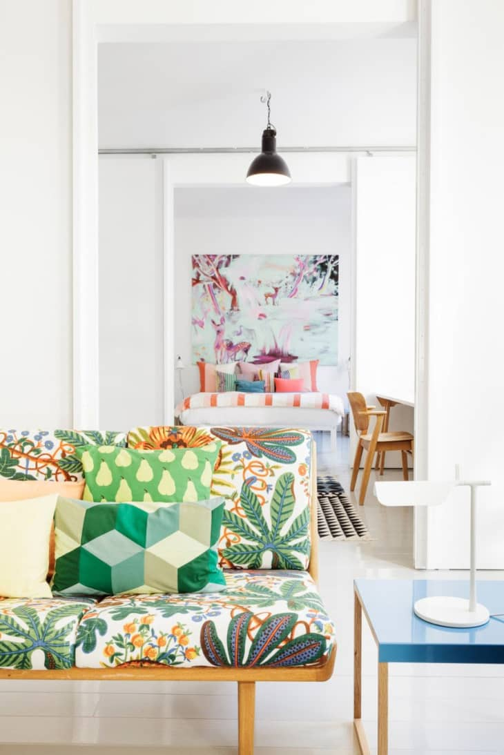
Minimalism, at its core, is about living with less, focusing on what truly matters, and creating an environment that promotes peace and clarity. But 'less' doesn't have to mean 'less joy' or 'less character'. Imagine a beautifully curated space, clean lines, uncluttered surfaces, and then, a single, brilliant splash of color. Perhaps it's a sapphire blue armchair against a backdrop of neutral tones, or a collection of vibrant art pieces on a pale grey wall. These aren't distractions; they're focal points, carefully chosen to add depth and life. This approach transforms a sterile environment into a warm, personalized haven. It’s about creating balance, where the quietude of minimalism is enhanced by the energy of thoughtful color.
Understanding the Minimalist Palette
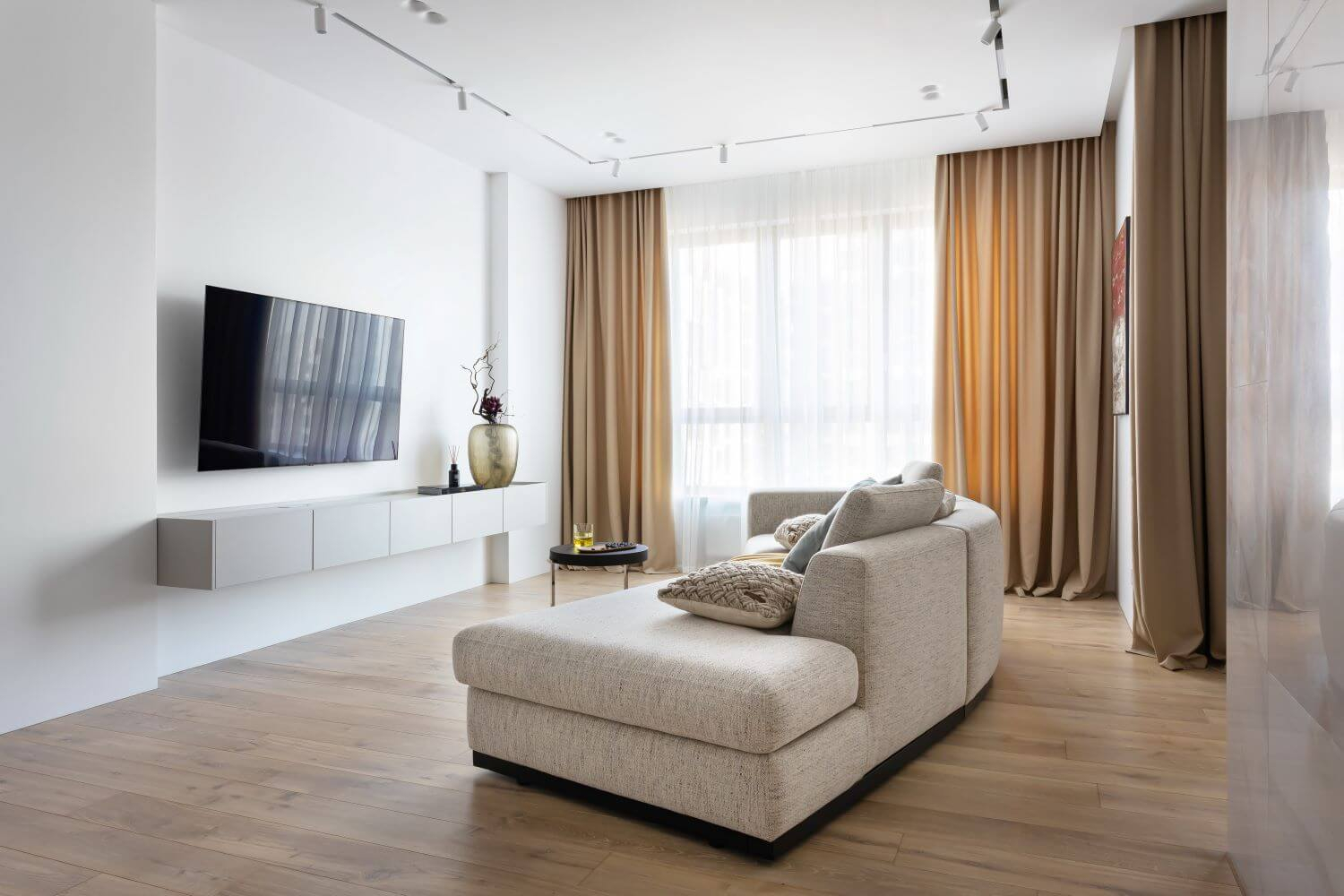
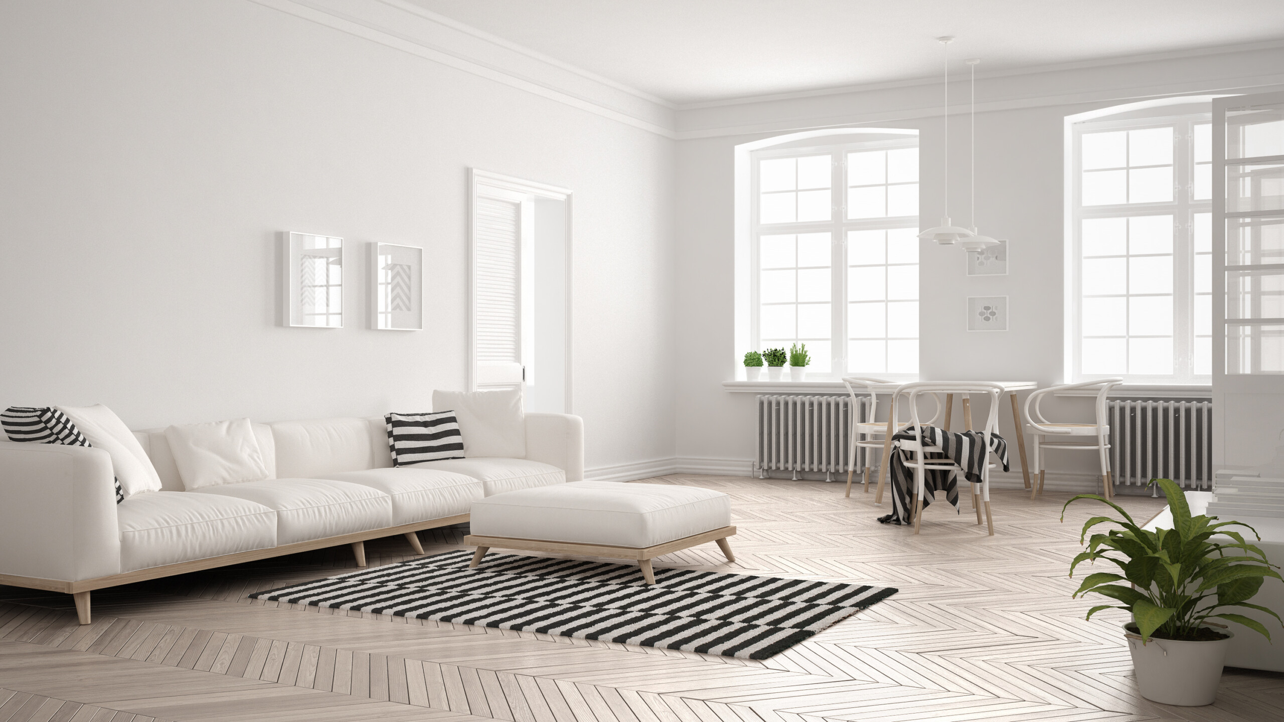
Before we dive into color, let's clarify the minimalist foundation. Think of your base colors as the canvas. Neutrals like white, cream, beige, grey, and even muted earthy tones work wonderfully. These shades create a sense of spaciousness and tranquility. They allow the eye to rest and prevent visual clutter. The goal here is to establish a calm, cohesive backdrop. This is where you build from. Without a solid, serene base, your pops of color might feel out of place, like they're shouting for attention rather than adding a harmonious note. It’s like choosing the right frame for a masterpiece – the frame shouldn’t compete with the art, but enhance it.
Choosing Your Pops: The Impact of Color
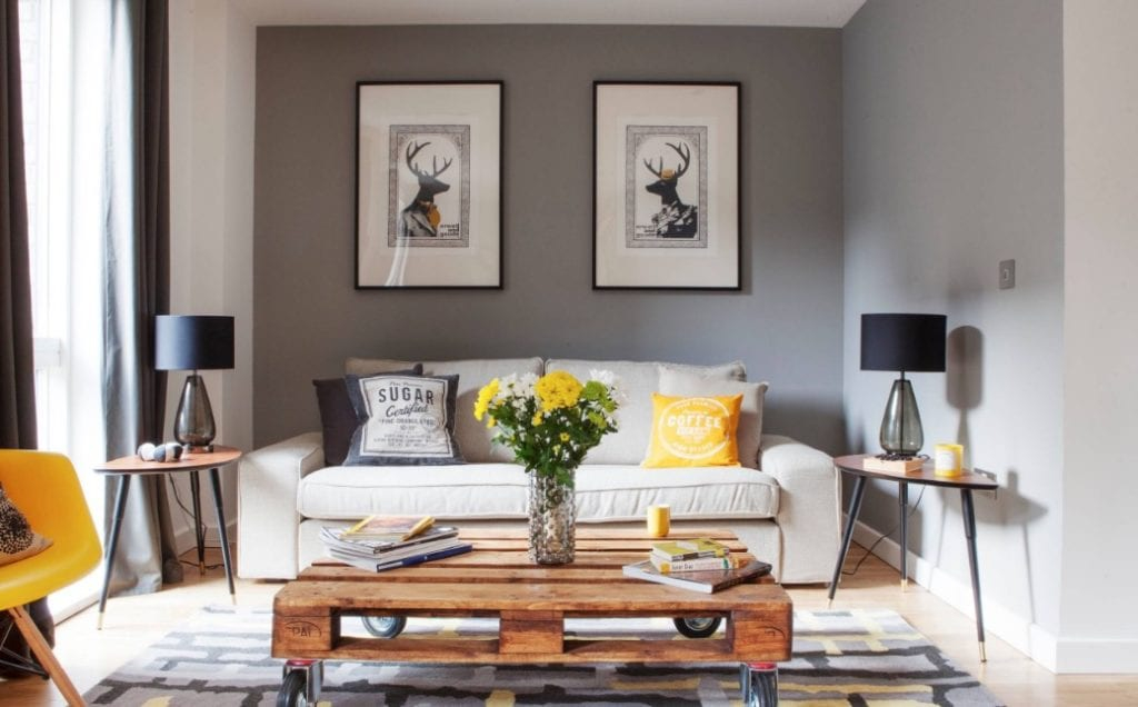
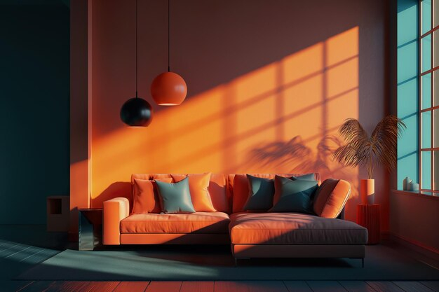
Now for the fun part. What colors will you choose to punctuate your space? The key is to select hues that resonate with you and evoke the desired feeling. Bold, saturated colors like emerald green, fiery red, or deep teal can add energy and drama. Softer, brighter shades like coral, sunshine yellow, or sky blue can bring a sense of joy and lightness. Consider the mood you want to create. A vibrant yellow cushion on a grey sofa can instantly lift the room’s spirits. A striking piece of abstract art with bold strokes of crimson can become a captivating centerpiece. Even a simple vase in a rich cobalt blue can make a significant statement. Don't be afraid to experiment, but remember the 'pop' principle – a little goes a long way.
Strategic Placement: Where to Add Color
The placement of your color accents is crucial. Think of it as strategic punctuation. You don’t want to scatter color randomly. Instead, choose specific elements to highlight. This could be:
- Textiles: Cushions, throws, rugs, or even curtains. These are easy to swap out if you want to change the feel of a room. A plush rug in a rich jewel tone can anchor a living area.
- Art and Decor: A single, impactful piece of artwork, a sculptural vase, or a curated collection of colorful books. These items draw the eye without demanding the entire room's attention.
- Furniture: A statement armchair, a colorful ottoman, or even a brightly painted accent table. This is a bolder move but can be incredibly rewarding. Imagine a classic Eames chair in a striking orange.
- Plants: The natural greenery of houseplants offers a beautiful, organic pop of color and life.
The idea is to create visual interest and guide the viewer's eye through the space. Consider the 'rule of three' – grouping items in odd numbers often looks more pleasing to the eye. For instance, three small, colorful vases on a shelf.
Balancing Act: Maintaining the Minimalist Vibe
This is perhaps the most important consideration. How do you add color without sacrificing the serene essence of minimalism? It's all about restraint and intention.
- Limit Your Palette: Stick to one or two accent colors. Too many vibrant hues can quickly lead to visual clutter, undermining the minimalist aesthetic.
- Consider Saturation: While bold colors can be striking, sometimes a slightly more muted or desaturated version of a vibrant hue can offer a sophisticated pop without being overwhelming.
- Proportion Matters: The size of your color element should be in proportion to the rest of the room. A large, brightly colored sofa might dominate a small space, whereas a few colorful cushions would be more appropriate.
- Quality Over Quantity: Choose well-designed, high-quality items for your color accents. A single, beautifully crafted ceramic bowl in a vibrant glaze will have more impact than several mass-produced, brightly colored trinkets.
Think of it as a carefully composed musical piece. The neutral tones are the background melody, and the pops of color are the striking solo notes that capture your attention and add emotional depth.
Practical Tips for Introducing Color
Starting with color can feel daunting, but it doesn't have to be. Here are some easy ways to begin:
- Start Small: Begin with smaller items like decorative pillows, a throw blanket, or a picture frame. See how they feel in your space.
- Use Books: Arrange books on a shelf with their spines facing outward. A stack of colorful hardcovers can be an instant mood booster.
- Embrace Nature: Fresh flowers or a beautiful potted plant can bring an organic and refreshing touch of color.
- Single Statement Piece: Invest in one standout piece of furniture or artwork in your chosen accent color.
- Seasonal Swaps: If you're hesitant to commit, use textiles like throws and cushions to introduce seasonal colors. You can easily swap them out as your mood or the season changes. For example, warm oranges and reds for autumn, crisp blues and greens for spring.
Creating Harmony and Flow
For your pops of color to truly enhance your minimalist space, they need to feel connected. How can you achieve this?
- Repeat Your Accent Color: Use your chosen accent color in a few different places throughout the room, or even in adjoining rooms. This creates a sense of continuity and cohesion. For example, if you have a blue vase in the living room, consider a blue cushion on a bedroom chair.
- Vary the Shades: You don't have to stick to one exact shade. Using different tones and tints of your accent color can add complexity and visual interest without becoming chaotic. A deep teal and a lighter turquoise, for instance.
- Consider Texture: Combining your color accents with different textures can add another layer of richness. A velvet cushion next to a linen throw, both in your accent color, can be wonderfully tactile and visually appealing.
- The Role of Light: Natural light can significantly impact how colors appear. Observe how your accent colors look at different times of day. A bright yellow might feel intense in direct sunlight but soft and inviting in the evening glow. Ensure your chosen spots receive adequate light to showcase the color effectively.
Minimalism and color are not mutually exclusive. In fact, when combined thoughtfully, they create spaces that are both calming and invigorating. By understanding the power of a neutral base, choosing your pops of color with intention, and placing them strategically, you can transform your home into a sanctuary that reflects your personality and brings you joy. Remember, it's about creating balance, about adding life without adding clutter. So go ahead, embrace a little color, and let your minimalist space truly shine. It’s your home, after all, and it deserves to feel as vibrant and unique as you are.