Ever walk into a room and just feel… something? Like it has a certain energy, a real sense of purpose? Often, that feeling comes down to a clever use of contrast. It's not just about black and white, though that's a classic start. Contrast is the secret sauce that makes your interiors sing, giving them life and visual interest. It's about bringing together different elements in a way that makes each one stand out, making the whole space more dynamic and engaging.
Think about it: a painting needs darks to make the lights shine. A melody needs quiet moments to make the crescendos powerful. Design is no different. Without contrast, a room can feel flat, uninspired, even a little boring. It’s like a conversation where everyone agrees on everything – nice, but not very stimulating. Contrast, however, injects that much-needed visual tension, drawing your eye around the room and creating a layered, thoughtful look. It's truly a game-changer for any interior, big or small. It’s not just about opposing colors either; it’s about textures, shapes, even historical periods. Let’s dive into how you can wield this potent design tool in your own abode.
The Core of Contrast: More Than Just Color
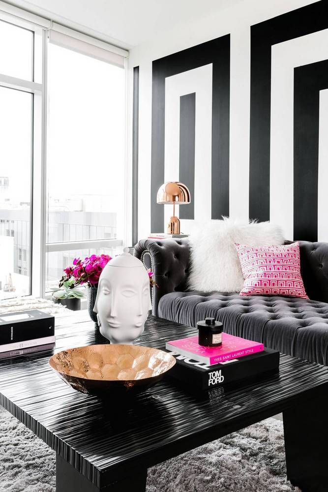
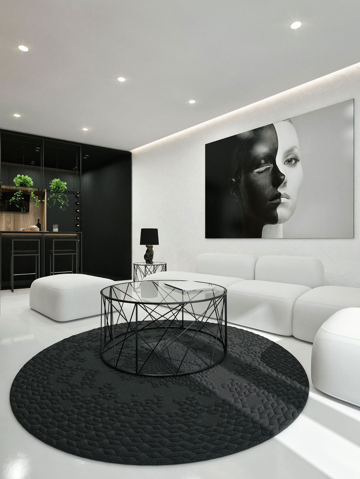
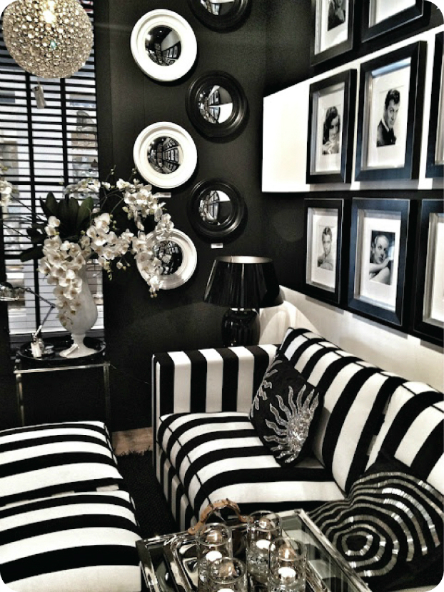
When most folks hear 'contrast,' their mind immediately goes to color. And sure, a stark black and white scheme, or a vibrant red against a cool blue, are classic examples. But contrast is a much broader concept in interior design. It's about juxtaposing any two elements that are significantly different to create visual impact and interest. Think about the feeling of a plush velvet sofa next to a rough, exposed brick wall. Or a sleek, modern lamp perched on an antique wooden table. These aren't just random pairings; they’re intentional choices that create a rich tapestry for the eyes. It's about making things pop by virtue of their differences. This approach adds depth and a sense of story to your rooms, inviting a closer look.
Playing with Light and Shadow: The Ultimate Contrast
One of the most fundamental and impactful forms of contrast comes from manipulating light and shadow. Imagine a sun-drenched room with bright, airy curtains, and then, in a corner, a cozy reading nook with a darker, more intimate feel, perhaps with a deep-toned accent wall and softer, directional lighting. This interplay of brightness and gloom, openness and enclosure, creates immediate visual intrigue. It guides the eye and defines different zones within a larger space. You can use blackout blinds or heavy drapes to create stark contrasts during the day, or strategically placed lamps to cast dramatic shadows at night. It's about creating mood and atmosphere through illumination, a powerful, yet often overlooked, aspect of design.
Texture Talk: Adding Depth Through Touch and Sight
Texture is where things get really interesting and tactile. It’s not just how something feels when you touch it, but also how it looks like it would feel. Consider a smooth, polished concrete floor against a shaggy, high-pile rug. Or the rough, natural grain of a reclaimed wood table paired with delicate, translucent glassware. These textural contrasts add layers and richness that prevent a room from feeling one-dimensional. They invite you to look closer, to imagine the sensation. You can mix hard and soft, rough and smooth, matte and glossy. This variety keeps the eye engaged and makes a space feel more luxurious and thoughtfully curated. Don't be afraid to experiment with different materials – metals, woods, fabrics, stone – to build this tactile depth.
Shape and Form: The Geometry of Interest
Our brains are wired to notice differences, and contrasting shapes and forms are a fantastic way to capitalize on this. If your room is full of straight lines and sharp angles – think rectangular sofas, square tables, linear shelving – introducing a few curves can make a huge difference. A round mirror, an oval coffee table, or even a sculptural, organic-shaped vase can break up the monotony and create a more dynamic composition. Conversely, in a room with lots of soft, rounded furniture, a piece with strong, angular lines can provide a welcome counterpoint. This interplay of geometric forms adds visual rhythm and prevents a space from feeling too rigid or too soft. It's like a visual dance between order and flow, creating a more balanced and captivating environment.
Pattern Play: Breaking the Visual Monotony
Patterns, too, offer a fantastic opportunity for contrast. Imagine a bold, geometric wallpaper on one wall paired with a more subtle, organic pattern on a throw pillow or an area rug. Or a large-scale floral print on curtains offset by small, intricate details on an adjacent piece of furniture. The key here is to vary the scale and type of patterns you use. Don’t use too many similar patterns, as that can make a room feel chaotic or overwhelming. Instead, aim for a deliberate mix. A busy pattern can be calmed by a solid block of color, and a simple space can be enlivened by a single, striking pattern. This thoughtful use of pattern contrast adds a layer of sophistication and personality to your decor, making it feel less generic and more unique. It’s about creating a visual conversation, where each pattern has its own voice, but they all work together in harmony.
Bringing It All Together: Practical Tips for Your Home
So, how do you actually make this work in your own home? Start small. Maybe try a contrasting throw pillow on a plain sofa. Or a dark-colored vase on a light-colored shelf. Don't feel like you have to overhaul everything at once. Think about one area you want to enhance.
Here are some actionable tips:
- Start with a focal point: Identify one element you want to highlight, then use contrast to draw attention to it. This could be an art piece, a fireplace, or a vibrant piece of furniture.
- Consider the 80/20 rule: Aim for about 80% of your room to be cohesive and harmonious, and then use the remaining 20% for contrasting elements. This prevents the space from feeling too jarring.
- Layer, layer, layer: Build up contrast through multiple elements – color, texture, shape, and pattern. A little bit of each goes a long way.
- Use opposites wisely: A dark wall with light trim, a rustic table with modern chairs, a soft rug on a hard floor. These simple pairings can create powerful effects.
- Don't forget the 'negative space': The empty areas in a room are just as important. Contrast isn't just about what you put in, but also about the space around those elements.
- Trust your gut: Ultimately, design is personal. If it feels right to you, it probably is. Experiment and have fun with it! Sometimes the most unexpected pairings create the most beautiful results. Remember, your home should tell your story, and contrast is a fantastic storyteller.
Unlocking the power of contrast in your home isn't about following rigid rules; it's about understanding how different elements interact to create a richer, more engaging environment. It’s about creating visual interest, guiding the eye, and adding layers of personality to your spaces. By thoughtfully introducing differences in color, light, texture, shape, and pattern, you can transform a bland room into one that feels vibrant, lived-in, and uniquely yours. Don't be afraid to experiment, to mix and match, and to let the interplay of opposing forces bring your home to life. After all, life itself is full of wonderful contrasts, isn't it? Your home should reflect that beautiful complexity.