For too long, neoclassical interior design has been pigeonholed as a realm of muted tones and understated elegance – a world where beige reigns supreme. But let me tell you, as someone who has spent decades immersed in the nuances of historical and contemporary design, that perception is a gross oversimplification. Neoclassicism, in its truest form, is a symphony of sophistication, balance, and yes, vibrant color. It's time to shed the beige blinders and discover the true, breathtaking palette of this timeless style.
When many people picture neoclassical interiors, they often conjure images of stately homes adorned in creams, ivories, and various shades of 'greige.' While these foundational neutrals certainly have their place, they are merely the canvas, not the entire masterpiece. The beauty of neoclassical design lies in its meticulous attention to detail, its reverence for classical antiquity, and its subtle yet impactful use of color to define spaces and evoke emotion. We're talking about a style that appreciates the subtle shift from a cool grey to a warm stone, and how a deep, rich accent can fundamentally alter the perceived grandeur of a room. It’s about understanding the historical context, the materials, and the light, all of which play a pivotal role in how these 'vibrant' colors are applied and perceived.
Historical Roots: Color in the Classical World and Its Neoclassical Revival
To truly appreciate the neoclassical palette, we must cast our gaze back to its origins. The ancient Greek and Roman structures that inspired this movement were far from the sterile white marbles we often imagine today. Archeological evidence consistently shows that these buildings and sculptures were painted in bold, often dazzling, hues. Think deep reds, vibrant blues, and even rich yellows. While neoclassical designers of the 18th and 19th centuries didn't replicate this exact vibrancy, they certainly drew inspiration from the idea of color as an integral part of architectural expression. They sought a refined version, a sophisticated echo of that ancient grandeur. This meant incorporating colors that conveyed dignity and grace, often derived from natural pigments – earthy terracottas, deep forest greens, and sky blues that weren't pastel but possessed a certain gravitas.
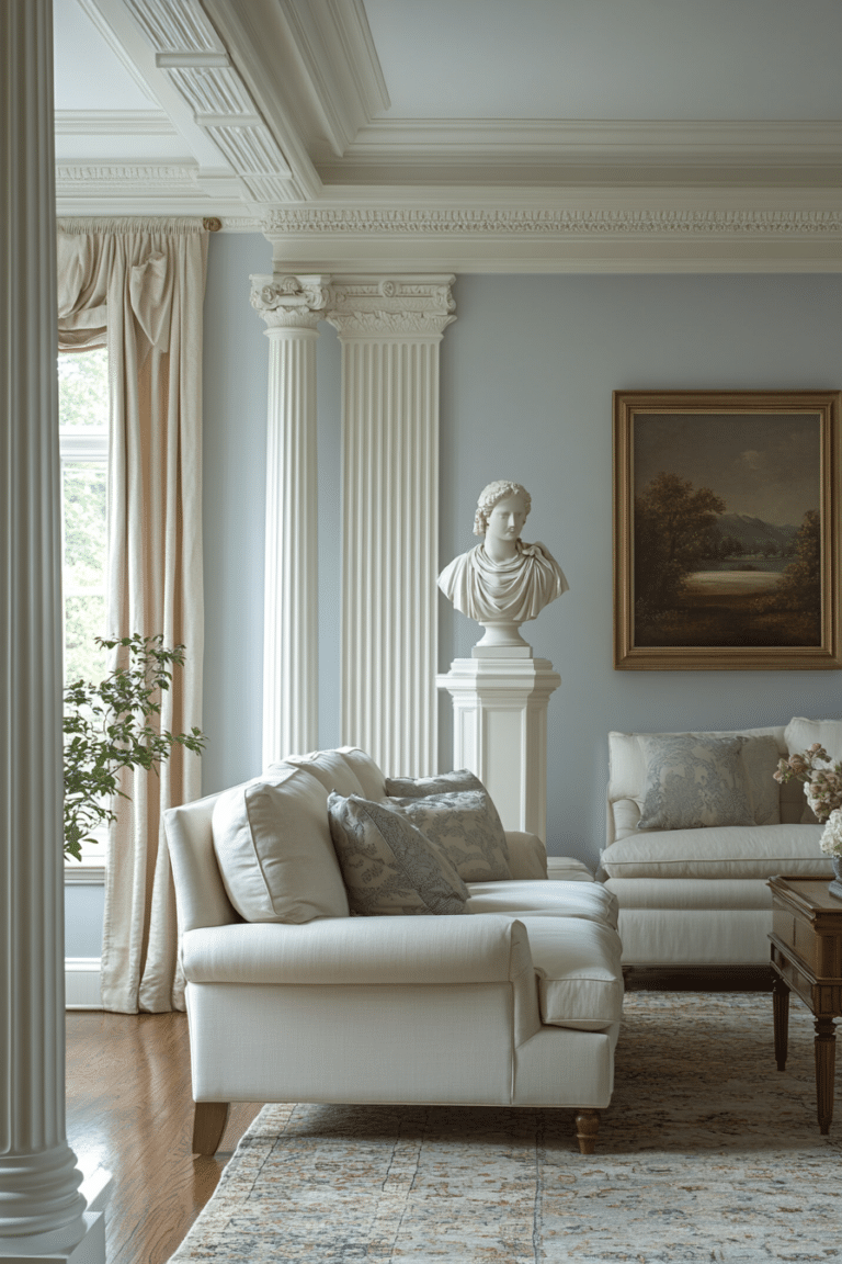
The Foundation: Elegant Neutrals as a Canvas for Color
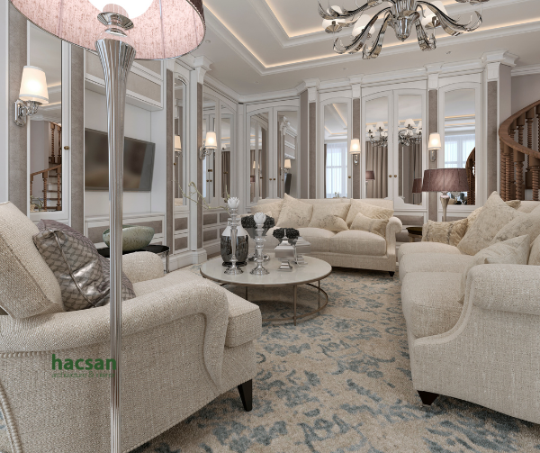
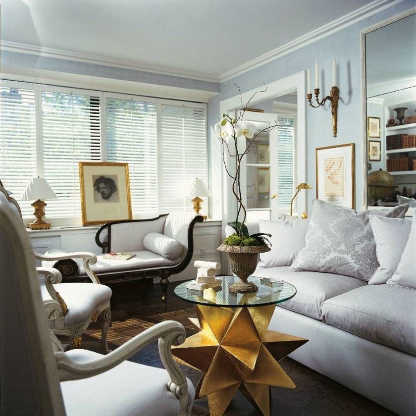
Yes, neutrals are fundamental, but they are not the end-all-be-all. In neoclassical design, these foundational shades – think soft creams, warm off-whites, gentle grays, and even muted stone tones – serve as the perfect backdrop. They provide a sense of calm and order, allowing the architectural lines and classical motifs to truly shine. But here's the trick: these aren't just any neutrals. They often have subtle undertones – a hint of pink in a cream, a whisper of green in a gray – that add depth and prevent the space from feeling flat. They are carefully chosen to complement, not compete with, the more saturated colors that are introduced through furnishings, textiles, and decorative elements. It's about creating a harmonious whole, where every element has its part to play.
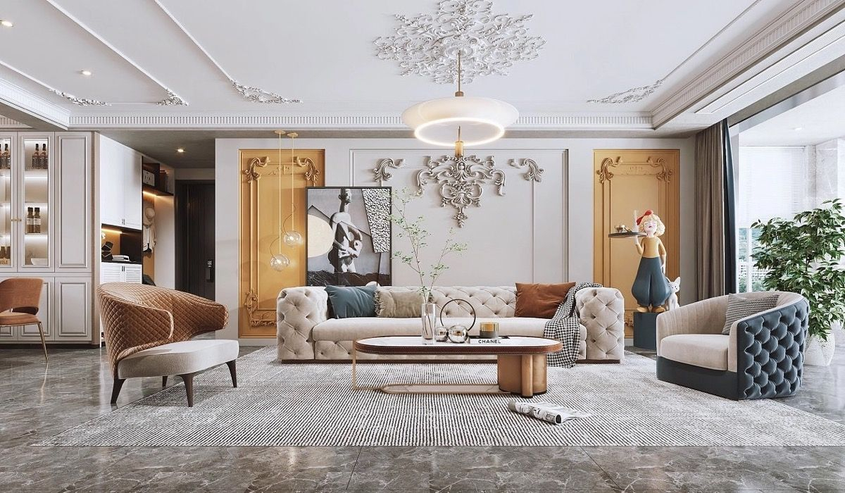
Introducing the 'Vibrant' in Neoclassical: Accent Hues and Their Impact
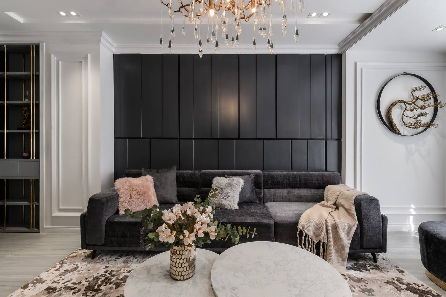
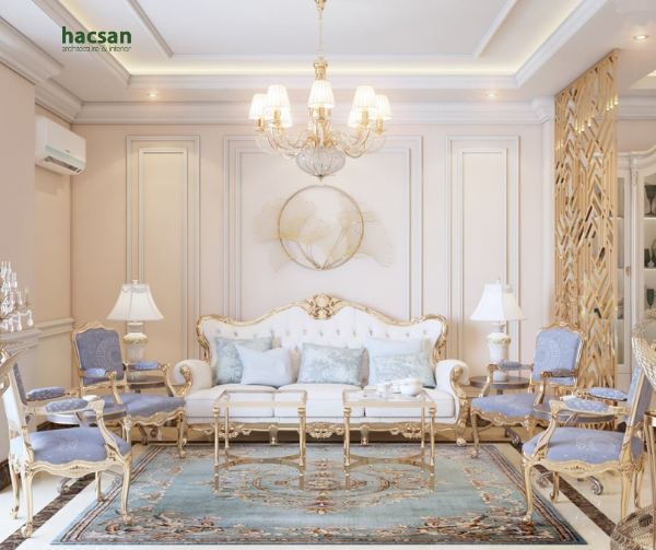
This is where the 'vibrant spectrum' truly comes into play. While large expanses of bold color might be rare, neoclassical interiors masterfully employ accent hues to create focal points and inject personality. Imagine a room dominated by soft grays and creams, then picture a magnificent deep navy velvet sofa, or perhaps draperies in a rich, almost regal, burgundy. These aren't random choices; they're deliberate, often drawn from the classical world's own symbolic colors. Think Pompeian red, a deep, earthy red that evokes ancient frescoes, or a rich lapis lazuli blue, reminiscent of precious pigments. Other popular choices include emerald green, often seen in silk or velvet, and even sophisticated golds or bronzes used in gilding and metallic accents. These colors are used with precision, often in smaller doses, to provide contrast, draw the eye, and elevate the overall aesthetic. It's a testament to the power of thoughtful color placement.
Texture and Materiality: The Unsung Heroes of Color Perception
You can have the most beautiful color on a paint chip, but its true impact in a neoclassical space is profoundly influenced by texture and material. A deep blue on a smooth, polished marble surface will appear vastly different from the same blue on a textured silk or a plush velvet. Neoclassical design revels in the interplay of materials: the cool smoothness of marble, the rich sheen of polished wood, the luxurious drape of silk, the intricate patterns of damask, and the soft inviting feel of velvet. These textures catch and reflect light in unique ways, making the colors within the room seem to shift and dance. A 'vibrant' green, for instance, might appear almost jewel-like on a satin cushion, while the same hue in a matte paint on a wall could feel more subdued and architectural. Understanding this relationship between color and surface is key to unlocking the true depth of the neoclassical palette.
Beyond the Walls: Furnishings, Art, and Decorative Elements as Color Carriers
The color narrative in a neoclassical interior isn't solely carried by the walls. In fact, much of the true 'vibrancy' often emerges through the curated collection of furnishings, artwork, and decorative objects. Imagine a classical bust set against a deep teal wall, or a gilded mirror reflecting the warm glow of a terracotta vase. Antique furniture, often crafted from rich woods like mahogany or walnut, brings its own inherent warmth and depth. Upholstery in brocades, silks, and velvets introduces patterns and colors that might be too bold for an entire wall but are perfect for an accent chair or settee. Artwork, from landscapes to portraits, provides splashes of color and focal points, guiding the eye and adding layers of visual interest. Even the smallest decorative items, like porcelain urns or bronze statuettes, contribute to the overall color story, proving that every element is an opportunity to enhance the aesthetic.
Achieving Balance and Harmony: The Neoclassical Approach to Color Application
The genius of neoclassical color use lies in its unwavering commitment to balance and harmony. It's not about throwing every color into a room. Instead, it's about a carefully considered 'recipe.' There's often a dominant neutral, one or two secondary accent colors, and then perhaps a very small 'pop' of a contrasting or complementary hue. The goal is to create a sense of serenity and order, even with the introduction of richer tones. This is achieved through repetition of colors in different elements, careful consideration of light sources, and a deep understanding of scale and proportion. It’s about building a visual rhythm, where colors flow seamlessly from one area to another, creating a cohesive and elegant environment. This isn't about being 'loud' or 'flashy'; it's about being profoundly impactful and sophisticated. A truly well-designed neoclassical space feels timeless, not trendy, and its colors play a huge part in that enduring appeal.
So, the next time you think of neoclassical interiors, I hope you'll look 'beyond beige.' I hope you'll see the subtle shifts in stone tones, the deep, resonant blues, the opulent reds, and the rich greens that truly define this magnificent style. It's a design philosophy that champions elegance, proportion, and a nuanced understanding of color's power to transform a space. By appreciating the full, vibrant spectrum of neoclassical interior color, we not only gain a deeper understanding of its historical lineage but also unlock its incredible potential for creating truly timeless and captivating environments in our own lives. It’s a design journey well worth taking, full of unexpected beauty and sophisticated surprises.